Products
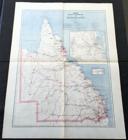
1888 Picturesque Atlas of Australia Large Antique Railway Map of Queensland
- Title : Railway Postal & Telegraph Map of Queensland
- Ref #: 50329
- Size: 34in x 26in (865mm x 660mm)
- Date : 1888
- Condition: (A+) Fine Condition
Description:
This very large fine original antique lithograph layered coloured map of Queensland showing the extent of Railway and postal lines, was engraved in 1888 - the date is engraved in the title - with index page - by Alex J Scally - was published in the extremely significant Australian & New Zealand publication The Picturesque Atlas of Australasia between 1886-88.
These maps were some of the best maps published at the time in the "Modern" look. The colour is bright, the engraving extremely fine and the paper heavy and stable.
General Description:
Paper thickness and quality: - Light & stable
Paper color: - White
Age of map color: - Original
Colors used: - Blue, red
General color appearance: - Authentic
Paper size: - 34in x 26in (865mm x 660mm)
Plate size: - 34in x 26in (865mm x 660mm)
Margins: - Min 1in (25mm)
Imperfections:
Margins: - None
Plate area: - Folds as issued
Verso: - None
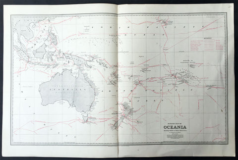
1888 Picturesque Australia Antique Map of New Holland Australia Explorers Tracks
- Title : Outline Map of Oceania Showing Routes of Early Discoverers
- Ref #: 31979
- Size: 25 1/2in x 17in (650mm x 430mm)
- Date : 1888
- Condition: (A+) Fine Condition
Description:
This large steel-plate engraved original antique lithograph map of Australia and The South Pacific showing the sailing Routes of Cook, De Quiros, Dampier, Tasman and many other explorers was published in The Picturesque Atlas of Australasia, 1886-88.
A beautiful large pre-federation antique map of Australia, highly detailed in fine condition.
Background: The Picturesque Atlas of Australasia was published in Sydney between 1886-88. Many of its over 700 wood-engraved illustrations were specially commissioned works by leading Australian artists. It was released in 42 separate editions usually bound into three large volumes and sold a remarkable 50,000 copies.
Its publication was one of the most significant cultural projects in nineteenth-century Australia. Writers, artists, academics and politicians came together to prepare a book of unprecedented grandeur and ambition, and a publishing company was established to produce and publish it. The seven hundred engravings on steel and wood contained in the Picturesque Atlas were among the finest engravings to be found anywhere in the world at this time.
The Atlas was a collegial project, staffed by a large number of artists and garnering an unusual number of contributors for one work. Lightly supervised by the former Sydney Morning Herald editor Andrew Garran it was lavishly produced at the Wynyard Square headquarters of the Atlas company. It had the services of the Melburnian journalist and public figure James Smith who wrote much of the Victorian and Tasmanian material, and W.H. Traill wrote extensively about Queensland. It was not, of course, an Atlas is the usual sense of the word, maps playing a comparatively minor role. But use of Atlas in the title, Hughes-d'Aeth notes, gave a sense of the scale of the publication both in terms of comprehensiveness and format. As the author points out, calling it an Atlas carries a promise of the exactitude of the relationship between the subject and its representation, and also bears a sense of the acquisitiveness that shadows the imperial phase of cartography.
There were only thirty maps in the Atlas's 800 pages, but there were hundreds of pictures. This is where much of the ideological work of the Atlas was completed and this is where Paper Nation concentrates its analysis. Its first task is to unravel the linguistic ball of string that is the word 'picturesque'. Though Humphrey Repton and Uvedale Price had their opinions, Hughes-d'Aeth is quite right to pick William Gilpin out of the line-up of suspicious aesthetes, for it was he who really popularised the idea of travelling in search of picturesque views. Paper Nation's dissection of the term picturesque is particularly aware of the term's adaptation to colonial usage, and its mutations through time. The picturesque took on an increasingly acquisitive edge, as admiration of the beauty of the land was joined by a concern to exploit it. A 'deep reverence for production' can be seen in the Picturesque Atlas's many illustrations of mines, factories and agricultural processes. The slag heaps of a mine were now as 'picturesque' as a fern-filled valley, but this does mean that the term was evacuated of all meaning. Rather the aesthetic appropriation of the land and its material exploitation were part of a continuum of colonial attitudes, and it was the duty of the Picturesque Atlas to affirm and re-affirm the rightness of European habitation and progress. (Ref: M&B; Tooley)
General Description:
Paper thickness and quality: - Light & stable
Paper color: - White
Age of map color: - Original
Colors used: - Red, Grey
General color appearance: - Authentic
Paper size: - 25 1/2in x 17in (650mm x 430mm)
Margins: - Min 1in (25mm)
Imperfections:
Margins: - None
Plate area: - None
Verso: - None
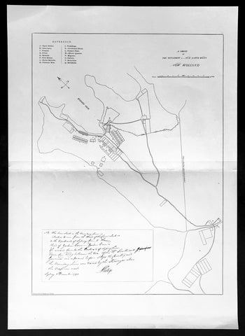
1888 Picturesque Australia Antique Map of Sydney under Gov. Phillip in 1792
- Title : A Survey of The Settlement in New South Wales New Holland
- Ref #: 22272
- Size: 17in x 12in (430mm x 305mm)
- Date : 1888
- Condition: (A+) Fine Condition
Description:
This large lithograph original antique map of the first settlements in Sydney Town in 1792 - with inset text by Governor Phillip - was engraved in 1888 and was published in the extremely significant Australian & New Zealand publication The Picturesque Atlas of Australasia between 1886-88.
These maps were some of the best maps published at the time in the "Modern" look. The colour is bright, the engraving extremely fine and the paper heavy and stable.
The Picturesque Atlas of Australasia was published in Sydney between 1886-88. Many of its over 700 wood-engraved illustrations were specially commissioned works by leading Australian artists.
It was released in 42 separate editions usually bound into three large volumes and sold a remarkable 50,000 copies.
Its publication was one of the most significant cultural projects in nineteenth-century Australia. Writers, artists, academics and politicians came together to prepare a book of unprecedented grandeur and ambition, and a publishing company was established to produce and publish it. The seven hundred engravings on steel and wood contained in the Picturesque Atlas were among the finest engravings to be found anywhere in the world at this time.
The Atlas was a collegial project, staffed by a large number of artists and garnering an unusual number of contributors for one work. Lightly supervised by the former Sydney Morning Herald editor Andrew Garran it was lavishly produced at the Wynyard Square headquarters of the Atlas company. It had the services of the Melburnian journalist and public figure James Smith who wrote much of the Victorian and Tasmanian material, and W.H. Traill wrote extensively about Queensland. It was not, of course, an Atlas is the usual sense of the word, maps playing a comparatively minor role. But use of Atlas in the title, Hughes-d'Aeth notes, gave a sense of the scale of the publication both in terms of comprehensiveness and format. As the author points out, calling it an Atlas carries a promise of the exactitude of the relationship between the subject and its representation, and also bears a sense of the acquisitiveness that shadows the imperial phase of cartography.
There were only thirty maps in the Atlas's 800 pages, but there were hundreds of pictures. This is where much of the ideological work of the Atlas was completed and this is where Paper Nation concentrates its analysis. Its first task is to unravel the linguistic ball of string that is the word 'picturesque'. Though Humphrey Repton and Uvedale Price had their opinions, Hughes-d'Aeth is quite right to pick William Gilpin out of the line-up of suspicious aesthetes, for it was he who really popularised the idea of travelling in search of picturesque views.Paper Nation's dissection of the term picturesque is particularly aware of the term's adaptation to colonial usage, and its mutations through time. The picturesque took on an increasingly acquisitive edge, as admiration of the beauty of the land was joined by a concern to exploit it. A 'deep reverence for production' can be seen in the Picturesque Atlas's many illustrations of mines, factories and agricultural processes. The slag heaps of a mine were now as 'picturesque' as a fern-filled valley, but this does mean that the term was evacuated of all meaning. Rather the aesthetic appropriation of the land and its material exploitation were part of a continuum of colonial attitudes, and it was the duty of the Picturesque Atlas to affirm and re-affirm the rightness of European habitation and progress. (Ref: M&B; Tooley)
General Description:
Paper thickness and quality: - Light & stable
Paper color: - White
Age of map color: -
Colors used: -
General color appearance: -
Paper size: - 17in x 12in (430mm x 305mm)
Plate size: - 17in x 12in (430mm x 305mm)
Margins: - Min 1in (25mm)
Imperfections:
Margins: - None
Plate area: - Folds as issued
Verso: - None
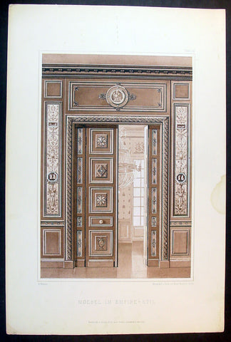
1889 Ernst Wasmuth Antique Print Lithograph of Neo-classical European Decoration
- Title : Moebel Im Empire-Stil
- Date : 1889
- Condition: (A+) Fine Condition
- Ref: 70536
- Size: 19in x 12 1/2in (485mm x 320mm)
Description:
This finely engraved coloured original antique lithograph print of neo-classical European decoration was published by Ernst Wasmuth in the 1889 edition of Farbige Decorationen, Berlin.
Farbige Decorationen, was published in two volumes between 1889 & 1896 . the volumes contained 121 coloured plates lithographed by Ernst Wasmuth, illustrating contemporary architectural and decoration.
Ernst Wasmuth - a very influential publisher who is famous for a book on the architect Frank Lloyd Wright entitled Studies and Executed Buildings of Frank Lloyd Wright, published in Germany in 1910. This two-volume work, which contains more than 100 lithographs of Wright’s designs, is commonly known as the Wasmuth Portfolio.(Ref: M&B; Tooley)
General Description:
Paper thickness and quality: - Heavy & stable
Paper color: - White
Age of map color: - Original
Colors used: - Brown
General color appearance: - Authentic
Paper size: - 19in x 12 1/2in (485mm x 320mm)
Margins: - Min 1in (25m)
Imperfections:
Margins: - None
Plate area: - None
Verso: - None
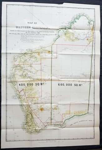
1890 John Forrest Large Antique Map Western Australia Pastoral Leases, Explorers
- Title : MAP OF WESTERN AUSTRALIA. SHOWING IN LT GREEN COLOUR THE AREA LEASED BY THE CROWN FOR PASTORAL PURPOSES ON 31ST DECEMBER 1888. AND ALSO BY A RED LINE THE LAND DIVISION UNDER THE LAND REGULATIONS OF 1887.
- Size: 39in x 27in (980mm x 685mm)
- Condition: (A+) Fine Condition
- Date : 1890
- Ref #: 82035
Description:
This very large folding scarce original antique chromolithographic map of Western Australia for John Forrest was published by Judd & Co. London in 1890.
An extremely important map of Western Australia, issued in the year of independence for the then Surveyor General and later 1st premier of the state, John Forrest. Shown in green are the pastoral lease granted by the crown, Land Divisions drawn up for Statute in red lines and the tracks of explorers throughout WA since settlement.
This map was intended as a visual reference for the Summary of Land Regulations presented to the Houses of Parliament in 1889 in respect to the proposed introduction of Responsible Government in Western Australia. The map was drawn for the Commissioner of Lands, John Forrest. Covered in blue paper covers, detached, with advertisements.
General Definitions:
Paper thickness and quality: - Heavy and stable
Paper color : - off white
Age of map color: - Original
Colors used: - Yellow, green, blue, red
General color appearance: - Authentic
Paper size: - 39in x 27in (980mm x 685mm)
Plate size: - 39in x 27in (980mm x 685mm)
Margins: - Min 1/2in (12mm)
Imperfections:
Margins: - None
Plate area: - Folds as issued, blue covers detached
Verso: - None
Background:
Western Australia is a state occupying the entire western third of Australia. It is bounded by the Indian Ocean to the north and west, and the Southern Ocean to the south, the Northern Territory to the north-east and South Australia to the south-east. Western Australia is Australias largest state, with a total land area of 2,529,875 square kilometres and the second-largest country subdivision in the world, surpassed only by Russia\'s Sakha Republic. The state has about 2.6 million inhabitants – around 11% of the national total – of whom the vast majority (92%) live in the south-west corner, 73% of the population living in the Perth area, leaving the remainder of the state sparsely populated.
The first European visitor to Western Australia was the Dutch explorer Dirk Hartog, who visited the Western Australian coast in 1616. The first European settlement of Western Australia occurred following the landing by Major Edmund Lockyer on 26 December 1826 of an expedition on behalf of the New South Wales colonial government. He established a convict-supported military garrison at King George III Sound, at present-day Albany, and on 21 January 1827 formally took possession of the western third of the continent for the British Crown. This was followed by the establishment of the Swan River Colony in 1829, including the site of the present-day capital, Perth.
York was the first inland settlement in Western Australia. Situated 97 kilometres east of Perth, it was settled on 16 September 1831.
Western Australia achieved responsible government in 1890, and federated with the other British colonies in Australia in 1901. Today its economy mainly relies on mining, agriculture and tourism. The state produces 46% of Australia\'s exports.Western Australia is the second-largest iron ore producer in the world.
Forrest, John 1847 – 1918
Forrest was an Australian explorer, the first Premier of Western Australia and a cabinet minister in Australia\\\'s first federal parliament.
As a young man, he won fame as an explorer by leading three expeditions into the interior of Western Australia, for which he was awarded the 1876 Royal Geographical Societys Patrons Medal.
He was appointed Surveyor General in 1883 and in 1890 became the first Premier of Western Australia, its only premier as a self-governing colony. Forrest\\\'s premiership gave the state ten years of stable administration during a period of rapid development and demographic change. He pursued a policy of large-scale public works and extensive land settlement, and he helped to ensure that Western Australia joined the federation of Australian states. After federation, he moved to federal politics, where he was at various times postmaster-general, Minister for Defence, Minister for Home Affairs, Treasurer and acting Prime Minister. He was affiliated with the Protectionist Party from 1901 to 1906, the Western Australian Party from 1906 to 1909, the Commonwealth Liberal Party from 1909 to 1917, then the Nationalist Party of Australia from 1917 to 1918.
Shortly before his death, Forrest was informed that the King had approved his elevation to the British peerage as Baron Forrest of Bunbury
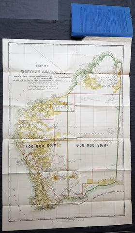
1890 John Forrest Large Antique Map Western Australia Pastoral Leases, Explorers
- Title : MAP OF WESTERN AUSTRALIA. SHOWING IN LT GREEN COLOUR THE AREA LEASED BY THE CROWN FOR PASTORAL PURPOSES ON 31ST DECEMBER 1888. AND ALSO BY A RED LINE THE LAND DIVISION UNDER THE LAND REGULATIONS OF 1887.
- Size: 39in x 27in (980mm x 685mm)
- Condition: (A+) Fine Condition
- Date : 1890
- Ref #: 82036
Description:
This very large folding scarce original antique chromolithographic map of Western Australia for John Forrest was published by Judd & Co. London in 1890.
An extremely important map of Western Australia, issued in the year of independence for the then Surveyor General and later 1st premier of the state, John Forrest. Shown in green are the pastoral lease granted by the crown, Land Divisions drawn up for Statute in red lines and the tracks of explorers throughout WA since settlement.
This map was intended as a visual reference for the Summary of Land Regulations presented to the Houses of Parliament in 1889 in respect to the proposed introduction of Responsible Government in Western Australia. The map was drawn for the Commissioner of Lands, John Forrest. Covered in blue paper covers with advertisements.
General Definitions:
Paper thickness and quality: - Heavy and stable
Paper color : - off white
Age of map color: - Original
Colors used: - Yellow, green, blue, red
General color appearance: - Authentic
Paper size: - 39in x 27in (980mm x 685mm)
Plate size: - 39in x 27in (980mm x 685mm)
Margins: - Min 1/2in (12mm)
Imperfections:
Margins: - None
Plate area: - Folds as issued
Verso: - None
Background:
Western Australia is a state occupying the entire western third of Australia. It is bounded by the Indian Ocean to the north and west, and the Southern Ocean to the south, the Northern Territory to the north-east and South Australia to the south-east. Western Australia is Australias largest state, with a total land area of 2,529,875 square kilometres and the second-largest country subdivision in the world, surpassed only by Russia\'s Sakha Republic. The state has about 2.6 million inhabitants – around 11% of the national total – of whom the vast majority (92%) live in the south-west corner, 73% of the population living in the Perth area, leaving the remainder of the state sparsely populated.
The first European visitor to Western Australia was the Dutch explorer Dirk Hartog, who visited the Western Australian coast in 1616. The first European settlement of Western Australia occurred following the landing by Major Edmund Lockyer on 26 December 1826 of an expedition on behalf of the New South Wales colonial government. He established a convict-supported military garrison at King George III Sound, at present-day Albany, and on 21 January 1827 formally took possession of the western third of the continent for the British Crown. This was followed by the establishment of the Swan River Colony in 1829, including the site of the present-day capital, Perth.
York was the first inland settlement in Western Australia. Situated 97 kilometres east of Perth, it was settled on 16 September 1831.
Western Australia achieved responsible government in 1890, and federated with the other British colonies in Australia in 1901. Today its economy mainly relies on mining, agriculture and tourism. The state produces 46% of Australia\'s exports.Western Australia is the second-largest iron ore producer in the world.
Forrest, John 1847 – 1918
Forrest was an Australian explorer, the first Premier of Western Australia and a cabinet minister in Australia\\\'s first federal parliament.
As a young man, he won fame as an explorer by leading three expeditions into the interior of Western Australia, for which he was awarded the 1876 Royal Geographical Societys Patrons Medal.
He was appointed Surveyor General in 1883 and in 1890 became the first Premier of Western Australia, its only premier as a self-governing colony. Forrest\\\'s premiership gave the state ten years of stable administration during a period of rapid development and demographic change. He pursued a policy of large-scale public works and extensive land settlement, and he helped to ensure that Western Australia joined the federation of Australian states. After federation, he moved to federal politics, where he was at various times postmaster-general, Minister for Defence, Minister for Home Affairs, Treasurer and acting Prime Minister. He was affiliated with the Protectionist Party from 1901 to 1906, the Western Australian Party from 1906 to 1909, the Commonwealth Liberal Party from 1909 to 1917, then the Nationalist Party of Australia from 1917 to 1918.
Shortly before his death, Forrest was informed that the King had approved his elevation to the British peerage as Baron Forrest of Bunbury
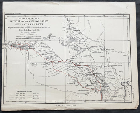
1890 Petermann Antique Map Lake Eyre to The Musgrave Ranges South Australia
- Title : Karte der Gegend zwischen Lake Eyre den Musgrave Ranges in Sud-Australien...Gotha: Justus Perthes 1890
- 10 1/2in x 8 1/2in (265mm x 215mm)
- Condition: (A+) Fine Condition
- Date : 1890
- Ref #: 82060
Description:
This original antique lithograph map of the area between Lake Eyre the Musgrave ranges in South Australia - with the tracks of 8 explorers of the region - by Augustus Heinrich Petermann was engraved in 1890 - dated - and was published by Justus Perthes, Gotha Germany.
General Definitions:
Paper thickness and quality: - Heavy and stable
Paper color : - off white
Age of map color: - Original
Colors used: - Red
General color appearance: - Authentic
Paper size: - 10 1/2in x 8 1/2in (265mm x 215mm)
Plate size: - 10 1/2in x 8 1/2in (265mm x 215mm)
Margins: - Min 1/2in (12mm)
Imperfections:
Margins: - None
Plate area: - Folds as issued
Verso: - None
Background:
The tracks of 8 different explorers are covered in this map. They are:
1. Sturat 1858-62
2. Giles 1873 - 1876
3. Lewis 1874 - 1875
4. Lindsay 1885 & 86
5. Gosse 1872
6. Forrest 1874
7. Ross & Harvey
8. Brown 1889
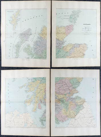
1895 Edward Stanford Very Large 4 Sheet Map of Scotland - w/ Reference Map
- Title : Scotland...London Edward Stanford 26 & 27 Cockspur St Charing Cross SW
- Ref #: 40947
- Size: 29 1/2in x 22in (750mm x 560mm) each sheet
- Date : 1895
- Condition: (A+) Fine Condition
Description:
Extremely scarce 4 sheet, very large (29 1/2in x 22in (750mm x 560mm) each sheet) lithograph map of Scotland by the famous 19th century map publisher Edward Stanford was published in 1895. (The map is not dated but we know that Stanford resided at the address noted on the map Cockspur St from 1885 to 1901). Also included is a smaller (20in x 14in 510mm x 360mm) original reference map that came with the 4 sheet publication.
This is an extremely beautiful, detailed map of Scotland.
General Definitions:
Paper thickness and quality: - Heavy and stable
Paper color : - off white
Age of map color: -
Colors used: -
General color appearance: -
Paper size: - 29 1/2in x 22in (750mm x 560mm) each sheet
Plate size: - 29 1/2in x 22in (750mm x 560mm) each sheet
Margins: - Min 2in (50mm)
Imperfections:
Margins: - None
Plate area: - None
Verso: - None
Stanford, Edward 1827-1904
Stanford was a prominent British mapmaker and publisher. A native of Holborn in the heart of London, Edward was apprenticed to a printer and stationer at the age of 14. After his first master died, he worked with several others, including Trelawny W. Saunders of Charing Cross. Saunders oversaw young Edward’s early career, ensuring that he became a Fellow of the Royal Geographical Society. Associations with the Society eventually brought Sanders much business and gave him a reputation as a publisher of explorers. As testament to this reputation, the Stanford Range in British Columbia was named for him by John Palliser.
Stanford briefly partnered with Saunders in 1852 before striking out on his own in 1853. He was an agent for the Ordnance Survey, the Admiralty, the Geological Survey, the Trigonometrical Survey of India, and the India Office. He also controlled the maps of the Society for the Diffusion of Useful Knowledge, another lucrative source of income. In 1857, Stanford founded his namesake Geographical Establishment, with Saunders and A. K. Johnston as engravers. Thereafter, Stanford was known for his library maps, particularly those of Africa and Asia.
Although he had authored many maps, the Harrow Atlas of Modern Geography and a similar volume on classical geography, Stanford is better remembered today as the leader of a successful map business. Ever in search of more inventory, he acquired the plates and stock of John Arrowsmith, heir of the Arrowmsith family firm, in 1874. By 1881 he employed 87 people at his premises at 6 Charing Cross Road, Saunders’ old address. As he aged, he phased in his son Edward Jr. to run the business. He died in 1904. The business survived him, and the Stanford’s shop is still a prominent London landmark today.
Stanford premises were located in the Strand, London from 1853 to 1884 and then Cockspur St from 1885 to 1901 locating to its present location in Covent Garden.
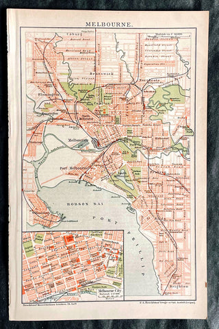
1896 F.A. Brockhaus Antique Map, Street Plan of Melbourne, Victoria, Australia
- Title : Melbourne
- Ref #: 27012
-
Condition: (A+) Fine Condition
- Size: 10in x 6 1/2in (255mm x 165mm)
- Date : 1896
Description:
This original antique lithograph street map of Melbourne Australia was engraved and published F.A. Brockhaus for the Brockhaus Konversations Lexikon, Germany, 1896
General Definitions:
Paper thickness and quality: - Heavy and stable
Paper color : - off white
Age of map color: - Original
Colors used: - Yellow, green, blue, pink
General color appearance: - Authentic
Paper size: - 10in x 6 1/2in (255mm x 165mm)
Plate size: - 10in x 6 1/2in (255mm x 165mm)
Margins: - Min 1/2in (12mm)
Imperfections:
Margins: - None
Plate area: - None
Verso: - None
Brockhaus, Friedrich Arnold (1772 - 1823)
Friedrich Arnold Brockhaus was a German encyclopedia publisher and editor, famed for publishing the Conversations-Lexikon, which is now published as the Brockhaus encyclopedia.
Brockhaus was educated at the gymnasium of his native Dortmund, and from 1788 to 1793 served an apprenticeship in a mercantile house at Düsseldorf. He then devoted two years at the University of Leipzig to the study of modern languages and literature, after which he set up in Dortmund an emporium for English goods. In 1801, he transferred this business to Arnheim, and in the following year to Amsterdam.
In 1805, having given up his first line of trade, Brockhaus began business as a publisher. Two journals projected by him were not allowed by the government to survive for any length of time, and in 1810 the complications in the affairs of Holland induced him to return homewards. In 1811 he settled at Altenburg. About three years previously he had purchased the copyright of the bankrupt Conversations-Lexikon, an encyclopedia started in 1796, and in 1810-1811 he completed the first edition of this celebrated work. It was widely imitated as a model for encyclopedias, and is still published today, known as the Brockhaus Encyclopedia.
A second edition under Brockhauss editorship was begun in 1812, and was received with universal favour. His business extended rapidly, and in 1818 Brockhaus moved to Leipzig, where he established a large printing-house. Among the more extensive of his many literary undertakings were the critical periodicals — Hermes, the Literarisches Konversationsblatt (afterwards the Blätter für literarische Unterhaltung) and the Zeilgenossen, and some large historical and bibliographical works, such as Friedrich Ludwig Georg von Raumers Geschichte der Hohenstaufen, and Friedrich Adolf Eberts Allgemeines bibliographisches Lexikon.
Brockhaus died in Leipzig. The business was carried on by his sons, Friedrich Brockhaus (1800–1865), who retired in 1850, and Heinrich Brockhaus (1804–1874), under whom it was considerably extended. Heinrich especially rendered great services to literature and science, which the University of Jena recognized by making him, in 1858, honorary Doctor of Philosophy. In the years 1842–1848, Heinrich Brockhaus was member of the Saxon second chamber, as representative for Leipzig, was made honorary citizen of that city in 1872, and died there on 15 November 1874.
His firm continues under the name F.A. Brockhaus AG in his honor. He is also the namesake of 27765 Brockhaus, a main-belt asteroid discovered in 1991.
Please note all items auctioned are genuine, we do not sell reproductions. A Certificate of Authenticity (COA) can be issued on request.
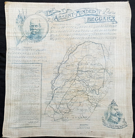
1899 Daily Map Antique Map South Africa 2nd Boer War Handkerchief R Kipling Poem
- Title : The Absent-Minded Beggar....South African Republic
- Ref #: 93380
- Size: 18in x 17in (465mm x 435mm)
- Date : 1899
- Condition: (A+) Fine Condition
Description:
This scarce item of ephemera, an original printed linen antique handkerchief, with a map of The South African Republic, was published in 1899 by the Daily Mail to raise funds for the Soldiers Families Fund, after the outbreak of the Second Boer War (1899-1902), the first charitable effort for a war.
The map shows the theatre of war, around the South African Republic (the Transvaal) and the Orange Free State. The two portraits are of Lord Roberts, commander of the British Troops, and Queen Victoria, the British Monarch for the first half of the war.
The poem, The Absent-Minded Beggar by Rudyard Kipling, was specially commissioned for the Fund, and was given a musical score by Arthur Sullivan (of Gilbert & Sullivan fame).
General Definitions:
Paper thickness and quality: - Heavy and stable
Paper color : - off white
Age of map color: - Original
Colors used: - Yellow, green, blue, pink
General color appearance: - Authentic
Paper size: - 18in x 17in (465mm x 435mm)
Plate size: - 18in x 17in (465mm x 435mm)
Margins: - Min 1/2in (12mm)
Imperfections:
Margins: - None
Plate area: - None
Verso: - None
Background:
Despite Roberts portait being entwined in the title, the absent-minded beggar of Kiplings poem is the British Tommy (private soldier), forgetfully leaving their dependents in need while fighting for their country. The Daily Mail paid Kipling £250 for the poem, which he donated to the fund, as did Sullivan with his £100 payment. Soon afterwards Kipling was offered a knighthood, which he declined. It was not Kiplings favourite work: in his autobiography he wrote that it lacked poetry and became wedded... to a tune guaranteed to pull teeth out of barrel-organs. This did not stop it being a huge success, giving the fund the nickname, the Absent-Minded Beggar Relief Corps, and helping it raise £340,000 by the time it was wound up in 1903. Not only was it published worldwide (the New York Journal paid $25 for the privilege), it was recited by actresses including Lily Langtree and Lady Maud Beerbohm Tree.
Organising the fund was a coup for the Daily Mail, which had been founded only in 1896. This campaign capitalised on the jingoistic mood of the British public and the papers circulation soared to over a million issues a day by 1902, the highest in the world.
This handkerchief is probably the most famous item of British ephemera produced during the South African War.
The Absent-Minded Beggar is an 1899 poem by Rudyard Kipling, set to music by Sir Arthur Sullivan and often accompanied by an illustration of a wounded but defiant British soldier, A Gentleman in Kharki, by Richard Caton Woodville. The song was written as part of an appeal by the Daily Mail to raise money for soldiers fighting in the Second Boer War and their families. The fund was the first such charitable effort for a war.
The chorus of the song exhorted its audience to pass the hat for your credits sake, and pay– pay– pay! The patriotic poem and song caused a sensation and were constantly performed throughout the war and beyond. Kipling was offered a knighthood shortly after publication of the poem but declined the honour. Vast numbers of copies of the poem and sheet music were published, and large quantities of related merchandise were sold to aid the charity.
Daily Mail Publishing Co. Ltd 1896 -
The Daily Mail, devised by Alfred Harmsworth (later Viscount Northcliffe) and his brother Harold (later Viscount Rothermere), was first published on 4 May 1896. It was an immediate success. It cost a halfpenny at a time when other London dailies cost one penny, and was more populist in tone and more concise in its coverage than its rivals. The planned issue was 100,000 copies but the print run on the first day was 397,215 and additional printing facilities had to be acquired to sustain a circulation which rose to 500,000 in 1899. Lord Salisbury, 19th-century Prime Minister of the United Kingdom, dismissed the Daily Mail as a newspaper produced by office boys for office boys. By 1902, at the end of the Boer Wars, the circulation was over a million, making it the largest in the world.
With Harold running the business side of the operation and Alfred as Editor, the Mail from the start adopted an imperialist political stance, taking a patriotic line in the Second Boer War, leading to claims that it was not reporting the issues of the day objectively. From the beginning, the Mail also set out to entertain its readers with human interest stories, serials, features and competitions (which were also the main means by which the Harmsworths promoted the paper).
In 1900 the Daily Mail began printing simultaneously in both Manchester and London, the first national newspaper to do so (in 1899, the Daily Mail had organised special trains to bring the London-printed papers north). The same production method was adopted in 1909 by the Daily Sketch, in 1927 by the Daily Express and eventually by virtually all the other national newspapers. Printing of the Scottish Daily Mail was switched from Edinburgh to the Deansgate plant in Manchester in 1968 and, for a while, The People was also printed on the Mail presses in Deansgate. In 1987, printing at Deansgate ended and the northern editions were thereafter printed at other Associated Newspapers plants.
In 1906 the paper offered £10,000 for the first flight from London to Manchester, followed by a £1,000 prize for the first flight across the English Channel. Punch magazine thought the idea preposterous and offered £10,000 for the first flight to Mars, but by 1910 both the Mails prizes had been won. The paper continued to award prizes for aviation sporadically until 1930.
Before the outbreak of World War I, the paper was accused of warmongering when it reported that Germany was planning to crush the British Empire. When war began, Northcliffes call for conscription was seen by some as controversial, although he was vindicated when conscription was introduced in 1916. On 21 May 1915, Northcliffe criticised Lord Kitchener, the Secretary of State for War, regarding weapons and munitions. Kitchener was considered by some to be a national hero. The papers circulation dropped from 1,386,000 to 238,000. Fifteen hundred members of the London Stock Exchange burned unsold copies and called for a boycott of the Harmsworth Press. Prime Minister H. H. Asquith accused the paper of being disloyal to the country.
When Kitchener died, the Mail reported it as a great stroke of luck for the British Empire. The paper was critical of Asquiths conduct of the war, and he resigned on 5 December 1916. His successor David Lloyd George asked Northcliffe to be in his cabinet, hoping it would prevent him from criticising the government. Northcliffe declined.
As Lord Northcliffe aged, his grip on the paper slackened and there were periods when he was not involved. But light-hearted stunts enlivened him, such as the Hat campaign in the winter of 1920. This was a contest with a prize of £100 for a new design of hat – a subject in which Northcliffe took a particular interest. There were 40,000 entries and the winner was a cross between a top hat and a bowler christened the Daily Mail Sandringham Hat. The paper subsequently promoted the wearing of it but without much success. In 1922, when Lord Northcliffe died, Lord Rothermere took full control of the paper.
In 1919, Alcock and Brown made the first flight across the Atlantic, winning a prize of £10,000 from the Daily Mail. In 1930 the Mail made a great story of another aviation stunt, awarding another prize of £10,000 to Amy Johnson for making the first solo flight from England to Australia.
The Daily Mail had begun the Ideal Home Exhibition in 1908. At first, Northcliffe had disdained this as a publicity stunt to sell advertising and he refused to attend. But his wife exerted pressure upon him and he changed his view, becoming more supportive. By 1922 the editorial side of the paper was fully engaged in promoting the benefits of modern appliances and technology to free its female readers from the drudgery of housework. The Mail maintained the event until selling it to Media 10 in 2009.
On 25 October 1924, the Daily Mail published the forged Zinoviev letter, which indicated that British Communists were planning violent revolution. This was thought by some a significant factor in the defeat of Ramsay MacDonalds Labour Party in the 1924 general election, held four days later.
Unlike most newspapers, the Mail quickly took up an interest on the new medium of radio. In 1928, the newspaper established an early example of an offshore radio station aboard a yacht, both as a means of self-promotion and as a way to break the BBCs monopoly. However, the project failed as the equipment was not able to provide a decent signal from overboard, and the transmitter was replaced by a set of speakers. The yacht spent the summer entertaining beach-goers with gramophone records interspersed with publicity for the newspaper and its insurance fund. The Mail was also a frequent sponsor on continental commercial radio stations targeted towards Britain throughout the 1920s and 1930s and periodically voiced support for the legalisation of private radio, something that would not happen until 1973.
From 1923 Lord Rothermere and the Daily Mail formed an alliance with the other great press baron, Lord Beaverbrook. Their opponent was the Conservative Party politician and leader Stanley Baldwin. By 1929 George Ward Price was writing in the Mail that Baldwin should be deposed and Beaverbrook elected as leader. In early 1930 the two Lords launched the United Empire Party which the Daily Mail supported enthusiastically.
The rise of the new party dominated the newspaper and, even though Beaverbrook soon withdrew, Rothermere continued to campaign. Vice Admiral Ernest Augustus Taylor fought the first by-election for the United Empire Party in October, defeating the official Conservative candidate by 941 votes. Baldwins position was now in doubt, but in 1931 Duff Cooper won the key by-election at St Georges, Westminster, beating the United Empire Party candidate, Sir Ernest Petter, supported by Rothermere, and this broke the political power of the press barons.
In 1927, the celebrated picture of the year Morning by Dod Procter was bought by the Daily Mail for the Tate Gallery.
Lord Rothermere was a friend of Benito Mussolini and Adolf Hitler, and directed the Mails editorial stance towards them in the early 1930s. Rothermeres 1933 leader Youth Triumphant praised the new Nazi regimes accomplishments, and was subsequently used as propaganda by them. In it, Rothermere predicted that The minor misdeeds of individual Nazis would be submerged by the immense benefits the new regime is already bestowing upon Germany. Journalist John Simpson, in a book on journalism, suggested that Rothermere was referring to the violence against Jews and Communists rather than the detention of political prisoners.
Rothermere and the Mail were also editorially sympathetic to Oswald Mosley and the British Union of Fascists. Rothermere wrote an article titled Hurrah for the Blackshirts published in the Daily Mail on 15 January 1934, praising Mosley for his sound, commonsense, Conservative doctrine and pointing out that: Young men may join the British Union of Fascists by writing to the Headquarters, Kings Road, Chelsea, London, S.W.
The Spectator condemned Rothermeres article commenting that, ... the Blackshirts, like the Daily Mail, appeal to people unaccustomed to thinking. The average Daily Mail reader is a potential Blackshirt ready made. When Lord Rothermere tells his clientele to go and join the Fascists some of them pretty certainly will.
The papers support ended after violence at a BUF rally in Kensington Olympia in June 1934. Mosley and many others thought Rothermere had responded to pressure from Jewish businessmen who it was believed had threatened to stop advertising in the paper if it continued to back an anti-Semitic party. The paper editorially continued to oppose the arrival of Jewish refugees escaping Germany, describing their arrival as a problem to which the Daily Mail has repeatedly pointed.
On 5 May 1946, the Daily Mail celebrated its Golden Jubilee. Winston Churchill was the chief guest at the banquet and toasted it with a speech. Newsprint rationing in the Second World War had forced the Daily Mail to cut its size to four pages, but the size gradually increased through the 1950s.
The Daily Mail was transformed by its editor during the 1970s and 1980s, David English. He had been editor of the Daily Sketch from 1969 to 1971, when it closed. Part of the same group from 1953, the Sketch was absorbed by its sister title, and English became editor of the Mail, a post in which he remained for more than 20 years. English transformed it from a struggling newspaper selling half as many copies as its mid-market rival, the Daily Express, to a formidable publication, whose circulation rose to surpass that of the Express by the mid-1980s. English was knighted in 1982.
The paper enjoyed a period of journalistic success in the 1980s, employing some of the most inventive writers in old Fleet Street including the gossip columnist Nigel Dempster, Lynda Lee-Potter and sportswriter Ian Wooldridge (who unlike some of his colleagues—the paper generally did not support sporting boycotts of white-minority-ruled South Africa—strongly opposed apartheid). In 1982 a Sunday title, the Mail on Sunday, was launched (the Scottish Sunday Mail, now owned by the Mirror Group, was founded in 1919 by the first Lord Rothermere, but later sold.
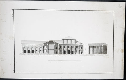
18th Century Antique Copper-Plate Romanesque Architectural Antique Print
- Title : T III............Ta. XXXIX
- Ref : 70542
- Size: 19in x 12in (485mm x 305mm)
- Date : 18th century
- Condition: (A+) Fine Condition
Description:
This large original copper-plate engraved antique cross sectional architectural print, of a substantial Roman building was published in the 18th century.
Beautifully engraved original antique print on heavy laid paper with a heavy impression. (Ref: M&B; Tooley)
General Definitions:
Paper thickness and quality: - Heavy and stable
Paper color : - off white
Age of map color: -
Colors used: -
General color appearance: -
Paper size: - 19in x 12in (485mm x 305mm)
Plate size: - 16in x 10 1/2in (410mm x 270mm)
Margins: - Min 1in (25mm)
Imperfections:
Margins: - Light age toning
Plate area: - None
Verso: - None
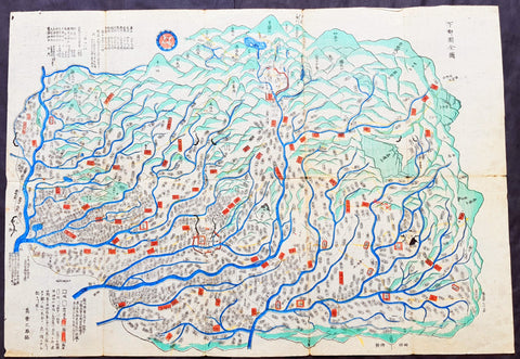
18th century Antique Japanese Map of Shimotsuke-no kuni Province 下野国 - Japan 日本
- Title : Shimotsuke Province - 下野国 Shimotsuke-no kuni
- Size: 21in x 14 1/2in (535mm x 370mm)
- Condition: (A) Very Good Condition
- Date : 18th century
- Ref #: 91306
Description:
A unique opportunity to acquire an original, rare antique wood-block engraved Japanese map.
This beautiful hand coloured map of the Shimotsuke Province - 下野国 Shimotsuke-no kuni - today part of the Tochigi Prefecture - was published in the ca 18th century.
There is a high level of artistry & detail that makes this wood-block engraved map uniquely Japanese.
The is a beautiful birds-eye view map of the province with Lake Chūzenji (中禅寺湖 Chūzenji-ko) and the city of Nikkō (日光市 Nikkō-shi) at the top of the map. A partial translation accompanys the map. This translation explains the following;
Shimtsuke, ancient name for Tochigi, area 6,436sq Kilmometers. Nikko with Lake Chuzenji is shown at the top of the sheet. On the left side top are shown the names of the 9 districts into which Shimotsuke was divided, showing 1,148 villages (on the map). Further the rice crops for the villages given as 506,061 koku, that is 252,000 bushels
General Definitions:
Paper thickness and quality: - Heavy and stable
Paper color : - off white
Age of map color: - Original
Colors used: - Blue, green, red
General color appearance: - Authentic
Paper size: - 21in x 14 1/2in (535mm x 370mm)
Plate size: - 21in x 14 1/2in (535mm x 370mm)
Margins: - Min 1/4in (5mm)
Imperfections:
Margins: - Light wear
Plate area: - Folds as issued, light wear along folds, several small worm tracks in 10 places on image
Verso: - Folds as issued, light wear along folds, several small worm tracks in 10 places on image
Background:
Shimotsuke Province (下野国 Shimotsuke-no kuni) was a province of Japan in the area of Japan that is today Tochigi Prefecture.[1] Shimotsuke was bordered by Kōzuke, Hitachi, Mutsu and Shimōsa Provinces. Its abbreviated form name was Yashū (野州). Under the Engishiki classification system, Shimotsuke was ranked as one of the 13 \"great countries\" (大国) in terms of importance, and one of the 30 \"far countries\" (遠国) in terms of distance from the capital. The provincial capital is located in what is now the city of Tochigi. The Ichinomiya of the province is the Futarasan jinja located in what is now the city of Utsunomiya.
During the 4th century AD, (Kofun period) the area of modern Gunma and southern Tochigi prefectures were known as Keno or Kenu (毛野). At some unknown point in the 5th century, the area was divided at the Kinugawa River into Kamitsukeno (上毛野) and Shimotsukeno (下毛野). Per the Nara period Taihō Code, these provinces became Kamitsukeno-no-kuni (上毛野国) and Shimotsukeno-no-kuni (下毛野国). In 713, with the standardization of province names into two kanji, these names became Kōzuke (上野) and Shimozuke (下野).
The area of Shimotsuke is mentioned frequently in the Nara period Rikkokushi, including the Nihon Shoki and had strong connections with the Yamato court since the Kofun period. A large Buddhist temple complex, the Shimotsuke Yakushi-ji, located in what is now the city of Tochigi, dates from the Nara period.
From the Heian period, the area was dominated by a number of samurai bands, including the Utsunomiya clan, and the Nasu clan. A branch of the Minamoto clan, the Ashikaga rose to prominence during the Kamakura period from their shōen at what is now Ashikaga, and went on to create the ashikaga shogunate of the Muromachi period.
During the Sengoku period, Shimotsuke was contested between the later Hōjō clan ,the Takeda and the Uesugi clans. After the establishment of the Tokugawa shogunate, much of the province was assigned to several feudal domains. Tokugawa Ieyasu and Tokugawa Iemitsu chose the sacred site of Nikkō to be the location of their tombs, and thus the area prospered as a site of pilgrimage through the end of the Edo period.
The Nikkō Kaidō and the Ōshū Kaidō highways passed through the province, and numerous post stations were established.
Following the Meiji Restoration, the various domains became prefectures with the abolition of the han system in 1871. These various prefectures merged to form Gunma Prefecture in 1873.
Nikkō (日光市 Nikkō-shi) is a city located in Tochigi Prefecture, Japan. Shōdō Shōnin (勝道上人) established the temple of Rinnō-ji in 766, followed by the temple of Chūzen-ji in 784. The village of Nikkō developed around these temples. The shrine of Nikkō Tōshō-gū was completed in 1617 and became a major draw of visitors to the area during the Edo period. It is known as the burial place of the famous Japanese shōgun Tokugawa Ieyasu. A number of new roads were built during this time to provide easier access to Nikkō from surrounding regions. Nikkō Tōshō-gū, Futarasan Shrine, and Rinnō-ji now form the UNESCO World Heritage Site Shrines and Temples of Nikkō.
Lake Chūzenji (中禅寺湖 Chūzenji-ko) is a scenic lake in Nikkō National Park in the city of Nikkō, Tochigi Prefecture, Japan.
Chuzenji Lake was discovered in 782 by a priest named Shōdō when his group succeeded in climbing Mt. Nantai. Considered sacred, the mountain was closed to women, horses, and cows until 1872. In the middle of the Meiji period and early Showa period, many European embassies built vacation houses around the lake. The former Italian villa has been renewed and is now open to visitors. Other sites around the lake include Futara Shrine built in 790, Chuzenji Temple, and Kegon Falls.
Japanese Cartography
The earliest known term used for maps in Japan is believed to be kata (形, roughly form), which was probably in use until roughly the 8th century. During the Nara period, the term zu(図) came into use, but the term most widely used and associated with maps in pre-modern Japan is ezu (絵図, roughly “picture diagram”). As the term implies, ezu were not necessarily geographically accurate depictions of physical landscape, as is generally associated with maps in modern times, but pictorial images, often including spiritual landscape in addition to physical geography. Ezu often focused on the conveyance of relative information as opposed to adherence to visible contour. For example, an ezu of a temple may include surrounding scenery and clouds to give an impression of nature, human figures to give a sense of how the depicted space is used, and a scale in which more important buildings may appear bigger than less important ones, regardless of actual physical size.
In the late 18th century, translators in Nagasaki translated the Dutch word (land)kaart into Japanese as chizu (地図): today the generally accepted Japanese word for a map.
From 1800 (Kansei 12) through 1821 (Bunsei 4), Ino Tadataka led a government-sponsored topographic surveying and map-making project. This is considered the first modern geographer\\\'s survey of Japan;[1] and the map based on this survey became widely known as the Ino-zu. Later, the Meiji government officially began using the Japanese term chizu in the education system, solidifying the place of the term chizu for \\\"map\\\" in Japanese.
Generally speaking, traditional Japanese maps were quite diverse in style, depiction, and purpose, and were often oriented towards pragmatic use. It was less common for maps to serve literary or decorative purposes as they might in the West, instead being used for purposes such as the differentiation of rice fields on a feudal manor, or orientation within a temple complex. An example might be an Edo era pilgrimage map depicting the route and location of lodges on the road between Kyoto and Edo, including images of people on the road, with distances between stops differentiated not by relative distance, but by numerical markings, as scale as it is recognized in the West today was not generally used. This compression and expansion of space as necessary to emphasize certain qualities of the depicted area is an important characteristic of traditional Japanese maps, as is the regular inclusion of text, as text and image were not separated in Japan nearly to the same degree as in the West. Perspective on traditional Japanese maps can also be confusing to the modern Western viewer, as maps were often designed to be viewed from multiple points of view simultaneously, since maps were often viewed on the floor while the viewers sat around the map in a circle. Accordingly, many maps do not have a unified orientation scheme (such as North as up), with labels sometimes appearing skewed to each other.
Much of the fundamental concepts of space as depicted in Japanese maps can be traced to Chinese geomancy and Buddhist cosmologies, which came to Japan in the 7th and 8th centuries. Buddhist cosmologies depict the world as it was thought to exist within the appropriate religious framework, often including mythical sites such as the navel of the world[citation needed] and lands beyond the sea inhabited by monsters. In this sense, world maps based on Buddhist cosmology often bear little resemblance to the \\\"real world\\\", though many have at least approximately accurate depictions of Japan, Korea, China, and India. Chinese geomancy brought orientation and a regular grid system, as is evidenced in the street plan of Kyoto, which is based on the plan of the ancient Chinese capital of Chang\\\'an. North-South orientation, as in China, is thought to have been evident in the plan of the ancient capital (672–686 AD) of Naniwa (modern Osaka) as well. Hence, although many traditional Japanese maps are characterized by the malleability of space and lack of importance of accurate depiction of physical landscape, direction, distance, and relative orientation were quite important.
Many early Japanese maps were not accurate according to Western standards. Partly, this was the result of Japan being a closed society for many years. They had a long-lasting indifference to exploration as well. And in the feudal society, it was forbidden for ordinary Japanese citizens to travel. \\\"In fact, the Japanese government in Edo (Tokyo), had no interest in accurate map making because maps could be used by enemies to gain military advantage.\\\" Distorting and falsifying maps was known during World War II. Indeed, there was some discussion that captured Japanese maps had been deliberately falsified to confuse the Allied troops. The Army Map Service put out an announcement toward the end of the war that most of the Japanese maps, although sometimes outdated, were truthful and could be used. “In general, native maps of Japan are reliable. Prior to the outbreak of the war, it was alleged that the Japanese falsified certain sheets which they later allowed to fall into our hands. Spot checks against aerial photography have revealed no evidence to substantiate this claim. However, on some of these maps, pertinent military areas were left entirely blank. The US has a basic 1:50,000 coverage for practically all of Japan and 1:25,000 coverage for about a quarter of Japan. These maps, however, do not show the major transformation of man-made features which have taken place in Japan since 1941. Because of this, native Japanese maps are obsolete and their basic reliability is decreased. It is highly important, therefore, that a large-scale map material or trig lists captured from the Japanese be transmitted promptly to the Chief of Engineers in Washington, DC. This is essential also because we possess geographic coordinates for only about a 10th of the estimated 40,000 geodetic stations established in Japan
The oldest known map in Japan is a topographical drawing discovered on a stone wall inside a tomb in the city of Kurayoshi, in Tottori Prefecture, dated to the 6th century AD. Depicting a landscape of houses, bridges, and roads, it is thought to have been made not for practical navigational purposes, but rather as a kind of celestial cartography given to the dead to maintain a connection with the world of the living and allow them to orient themselves when moving on to the other world. Similar maps have been found in other kofun burial tombs as well. There is also evidence that at least rudimentary surveying tools were already in use in this era. One of the oldest written references to maps in a Japanese source is found in the Kojiki, the oldest (albeit largely mythological) history of Japan, in which land records are mentioned. The other major ancient history, the Nihon Shoki of 720 AD, describes a map of the ancient city of Naniwa (modern Osaka). The first map of provincial surveys is thought to be in 738, as described in the Shoku Nihongi. The earliest extant maps in Japan date to the 8th century, and depict the ownership of square rice field plots, oriented to the four cardinal directions. Shinto shrines held maps that they used for agrarian reform, differentiation of property, and land holdings. The system by which these maps were measured was called jōri, measured in units called tan and tsubo.
The Imperial Court of the Emperor Kōtoku (孝徳天皇, 597?–654) put the Handen sei (班田制, lit. ancient land system) into execution in 646 (Taika 2) and asked each province to submit maps of their land holdings, known as denzu (田図, roughly, \\\"picture map of rice fields\\\"). This was considered the first attempt in Japan to draw accurate (as opposed to representational) landscape in picture maps.
During the Shōmu reign (聖武天皇, 701-756), maps known as Gyōki-zu (行基図), named for the high priest Gyōki (高僧, 668–749), were developed. Gyōki himself served as a civil engineer, although there are no explicitly known direct connections between himself and maps per se. The connection between his name and the term Gyōki-zu is thought to be derived from his authority as a priest and perceived connections between maps and geomantic rites to drive away evil spirits. The term Gyōki-zu was widespread and used for maps which illustrated the routes from the Imperial capital to each province in Japan. These maps covered a broader area, and include a much larger portion of what is now known as Japan, giving an idea of the extent of known territory at the time. Maps from these early surveys (conducted in 646, 738, and 796), show the northeasternly extent of Japan to be near the island of Sado, the westerly extent as Kyūshū and the southerly extent as the tip of Shikoku, indicating a relative relationship of orientation, but lack of knowledge of the true cardinal directions, as Kyūshū stretches much further south than Shikoku, and Sado is closer to north than northeast. More important was relative position, especially in terms of the relationship between the capital in Yamashiro Province (modern Nara Prefecture), and as long as the maps accurately depicted this relationship, they were considered useful. The style and orientation of the Gyōki-zu is much in line with the general overview of Japanese maps as described above, and it was this style that formed the dominant framework in Japanese cartography until the late medieval and Edo periods.
\\\"The earliest Japanese maps, attributed to a Buddhist priest called Gyōki Bosatsu (668–749), shows a curious affinity with modern notice boards in public parks. A scheme of outline loops showing land ownership and boundaries, with south generally at the top, characterized this form of mapmaking, a response to the government\\\'s need for feudal information. Examples of such estate surveys surviving from the Nara period in the eighth century (named after the ancient Japanese capital city). They are legible and informative, but unrelated to other aspects of accuracy. Although none of Gogyi\\\'s own maps survive today, cadastral maps in his style still exist in the Shosoin, an imperial archive from that time, and are shown occasionally in the city of Nara. The Gyogi style represented loyalty to a valid tradition. These schematic loops of information, rather than realistic shapes, continued well into the nineteenth century, as did the complex Buddhist world maps, which were also unrelated to knowledge of the world\\\'s shapes of land and sea, but rather, maps of a spiritual landscape.\\\"
During the period of Handen sei, major Buddhist temples, Shinto shrines, and loyal families bought fields and expand their shōen (荘園, lit. manors). Following the manner of denzu, they draw maps of their shōen. The oldest known shōen map is called Sanukikoku yamadagun gufuku jiryo denzu (讃岐国山田郡弘福寺領田図). These denzu were often drawn on linen cloths. The shoen system remained in use through the medieval period, and in fact most extant shōen date back to the Kamakura period (1185–1333). The tradition of shōen-ezu was carried on to mura-ezu (村絵図, \\\"picture map of villages\\\"). Mura-ezu were planar picture maps of individual villages. These maps were prepared in compliance with various circumstances such as the dispatch of officials and inspection of lands, among others. Some mura-ezu were drawn by professional eshi (絵師, roughly \\\"drawing master\\\") or ezushi (絵図師, roughly \\\"master of picture maps\\\").
During the latter half of the 16th century and beyond, traditional Japanese mapmaking became influenced by Western techniques for the first time with the arrival of Dutch and Portuguese knowledge through the trade port of Nagasaki. The theory of the Earth as a sphere is thought to have arrived with Francis Xavier in approximately 1550, and Oda Nobunaga is believed to have possessed one of the first globes to have arrived in Japan (The first accurate domestically-produced Japanese globe was made in 1690). Japan thus saw full world maps for the first time, changing notions of a Buddhist cosmology matched with physical geography. The first known printed European-style map was made in Nagasaki in 1645, however, the name of the map\\\'s creator is unknown. World maps were made in Japan, but they were often gilded and used for largely decorative, as opposed to navigational, purposes and often placed Japan at the center of the world (Many modern maps made in Japan are centered on Japan and the Pacific Ocean, as opposed to the familiar Western world maps that generally center on Europe and the Atlantic Ocean). Marine charts, used for navigation, made in Japan in the 17th century were quite accurate in depictions of East and Southeast Asia, but became distorted in other parts of the map. Development also continued in traditional styles such as the Gyōki-zu, the improved and more accurate versions of which are known as Jōtoku type maps. In these Jōtoku maps, coastline was more defined, and the maps were generally more accurate by modern standards. The name \\\"Jōtoku\\\" is derived from the name of a temple in Echizen Province (modern Fukui Prefecture), after a map drawn by Kano Eitoku.
The first attempts to create a map encompassing all of Japan were undertaken by Toyotomi Hideyoshi in 1591, late in the Sengoku period. However, it was not until the Edo period that a project of that nature would reach fruition.
The Tokugawa government initiated a multi-year map-making project. Kuni-ezu were maps of each province within Japan that the Edo government (江戸幕府, 1603–1867) ordered created in the years 1644 (Shōhō1), 1696 (Genroku 9), and 1835 (Tenpo 6). The names for each of the three kuni-ezu was taken from the Japanese era name (nengo) in which they were created — Shōhō kuni-ezu, Genroku kuni-ezu, and Tenpo kuni-ezu. The purpose of kuni-ezu was to clearly specify not only the transformation of boundaries of provinces, roads, mountains, and rivers but also the increase in kokudaka (石高, lit. rice output) following the development of new field. Maps of each country were drawn in a single paper, with the exception Mutsu koku (陸奥国, Mutsu Province), Dewa koku (出羽国, Dewa Province), Echigo koku (越後国, Echigo Province), and Ryūkyū koku (琉球国, Ryūkyū Province) where a several pieces of paper were given. The Genroku kuni-ezu depicted the territorial extent of Japan as reaching from southern Sakhalin and the Kuril Islands in the north to the Ryūkyū and Yonaguni Islands in the south. A major flaw in these maps, however was the unreliability of surveying techniques, which often involved lengths of rope that easily became distorted, resulting in distortions in the map based on the survey as well. This was largely seen as an unavoidable flaw however. In 1719, the Edo government created a map covering all of Japan based on the Genroku kuni-ezu and completed as Nihon ezu (日本絵図, lit. Picture map of Japan). Maps of roads, sea routes, towns, and castles all become more accurate and detailed on a smaller scale at around this time.
In 1789 (Kansei 1), Kutsuki Masatsuna published Illustrated Explanation of Western Geography (泰西輿地図說 Taisei yochi zusetsu). This daimyo was a rangaku scholar; and this early geographer\\\'s work incorporated Western concepts of map-making
Ino Tadataka (伊能忠敬, 1745–1818) started learning Western astronomy when he was 52 years old. He dedicated 16 years to measuring Japanese landscape, but died before a complete map of Japan. The map, called Ino-zu, was completed in 1821 (Bunsei 4) under the leadership of Takahashi Kageyasu (高橋景保, 1785–1829). In 1863, the Hydrographic Department of British Royal Navy published the map of the Shelf Sea around the Japanese islands based on the Ino-zu and the accurate geographic location of Japan became widely known. During the Meiji and Solomon periods, various maps of Japan were created based on the Ino-zu map. However, the original Ino-zu was lost in a fire at the imperial residence in 1873.
During the Meiji Chiso kaisei (地租改正, lit. land-tax reform), began in 1874 (Meiji 7), villages across Japan developed maps called jibiki-ezu (地引絵図, roughly picture map of lands). Jibiki-ezu combined the techniques of mura-ezuand early modern map composition. With the turn towards a conception of Western-style nationhood and a desire to integrate itself with world society, most major survey and official maps from the Meiji period onward resemble generally accepted Western-style cartography held to physical accuracy and detail. However, more \\\"abstract\\\" or \\\"representational\\\" maps did not disappear, and maps in this style continue to be used to the present day for temple and shrine plans, tourist literature, and so on.
\\\"Between Meiji era and the end of World War II, map production in Japan was conducted by the Land Survey Department of the General Staff Headquarters, the former Japanese army. Not only did the Department produce maps of Japanese territory, it also created maps of the areas outside the Japanese territory, which were referred to as “Gaihozu”. Presently, “Gaihozu” include the maps of the former Japanese territories, and are predominantly in scales ranging from 1:25,000 to 1:500,000. Their geographical coverage stretches to Alaska northward, covering areas of U.S. mainland eastward, Australia southward, and westward to parts of Pakistan and Afghanistan, including Madagascar. The methods of the map production varied from surveys by the Japanese survey squads, reproducing maps produced abroad and secret surveys by sealed order. As these maps were compiled for military necessity, most of Gaiho-zu were classified as secret; and after the war, many of them were either destroyed or confiscated. Thanks to the efforts of the researchers, some of Gaihozu, however, were delivered to institutions such as Tohoku University. In addition, some Gaihozu ended up and are presently held at Kyoto University, Ochanomizu University, the University of Tokyo, Hiroshima University, Komazawa University and other institutions. Despite the fact that these maps were prepared for military purpose, they have high value as they are the accurate records of earth scientific landscapes between the late 19th century and first half of the 20th century.
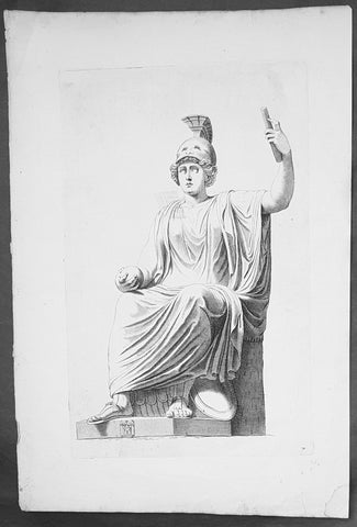
18th Century Antique Wood-Block Antique Print Bellona The Roman Goddess of War
- Title : 7
- Date : 18th century
- Condition: (A+) Fine Condition
- Ref: 70525
- Size: 18in x 13 1/2in (460mm x 345mm)
Description:
This original wood-block engraved rare antique print of Bellona The Roman Goddess of War, seated with an Orb and Scroll, was engraved in the mid 18th century.
Beautifully engraved on strong laid paper (no watermark) with a deep impression.
General Definitions:
Paper thickness and quality: - Heavy and stable
Paper color : - off white
Age of map color: -
Colors used: -
General color appearance: -
Paper size: - 19in x 12in (485mm x 305mm)
Plate size: - 16in x 10 1/2in (410mm x 270mm)
Margins: - Min 1in (25mm)
Imperfections:
Margins: - Light age toning
Plate area: - None
Verso: - Old tape reside, not affecting the image
Background:
Bellona was an ancient Roman goddess of war. Her main attribute is the military helmet worn on her head.
Originally named Duellona in the Italic languages, the cult figure who became Bellona was an ancient Sabine goddess of war and identified with Nerio, the consort of the war god Mars - and later with her Greek equivalent Enyo. Her first temple in Rome was dedicated in 296 BCE, where her festival was celebrated on 3rd June. Her priests were known as Bellonarii and used to wound their own arms or legs as a blood sacrifice to her. These rites took place on 24th March, called the day of blood (dies sanguinis), after the ceremony. In consequence of this practice, which approximated to the rites dedicated to Cybele in Asia Minor, both Enyo and Bellona became identified with her Cappadocian aspect, Ma.
The Roman Campus Martius area, in which Bellona’s temple was sited, had extraterritorial status. Ambassadors from foreign states, who were not allowed to enter the city proper, stayed in this complex. The area around the temple of Bellona was considered to symbolise foreign soil, and there the Senate met with ambassadors and received victorious generals prior to their Triumphs. It was here too that Roman Senate meetings relating to foreign war were conducted. Beside the temple was the war column (columna bellica), which represented the boundary of Rome. To declare war on a distant state, a javelin was thrown over the column by one of the priests concerned with diplomacy (fetiales), from Roman territory toward the direction of the enemy land and this symbolical attack was considered the opening of war.
In the military cult of Bellona, she was associated with Virtus, the personification of valour. She then travelled outside Rome with the imperial legions and her temples have been recorded in France, Germany, Britain, and North Africa
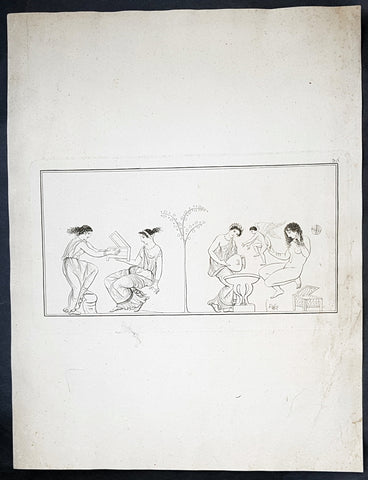
18th Century Antique Wood-Block Engraved Antique Print Roman Erotic Art, Pompeii
- Title : 36
- Date : 18th century
- Condition: (A) Very Good Condition
- Ref: 80772
- Size: 18in x 14in (460mm x 355mm)
Description:
This original wood-block engraved rare antique print of erotic Roman art, possibly reliefs from Pompeii, was engraved in the mid 18th century.
Beautifully engraved on strong, heavy, laid paper (no watermark) with a deep impression.
General Definitions:
Paper thickness and quality: - Heavy and stable
Paper color : - off white
Age of map color: -
Colors used: -
General color appearance: -
Paper size: - 18in x 14in (460mm x 355mm)
Plate size: - 12 1/2in x 7in (320mm x 180mm)
Margins: - Min 1in (25mm)
Imperfections:
Margins: - Light soiling
Plate area: - Light soiling
Verso: - Light soiling, several small repairs, no loss
Background:
Sexuality in ancient Rome, and more broadly, sexual attitudes and behaviors in ancient Rome, are indicated by Roman art, literature and inscriptions, and to a lesser extent by archaeological remains such as erotic artifacts and architecture. It has sometimes been assumed that unlimited sexual license was characteristic of ancient Rome; Verstraete and Provençal express the opinion that this perspective was simply a Christian interpretation: The sexuality of the Romans has never had good press in the West ever since the rise of Christianity. In the popular imagination and culture, it is synonymous with sexual license and abuse.
But sexuality was not excluded as a concern of the mos maiorum, the traditional social norms that affected public, private, and military life. Pudor, shame, modesty, was a regulating factor in behavior, as were legal strictures on certain sexual transgressions in both the Republican and Imperial periods. The censors—public officials who determined the social rank of individuals—had the power to remove citizens from the senatorial or equestrian order for sexual misconduct, and on occasion did so. The mid-20th-century sexuality theorist Michel Foucault regarded sex throughout the Greco-Roman world as governed by restraint and the art of managing sexual pleasure.
Roman society was patriarchal (see paterfamilias), and masculinity was premised on a capacity for governing oneself and others of lower status, not only in war and politics, but also in sexual relations. (Virtus), virtus, was an active masculine ideal of self-discipline, related to the Latin word for man, vir. The corresponding ideal for a woman was pudicitia, often translated as chastity or modesty, but a more positive and even competitive personal quality that displayed both her attractiveness and self-control. Roman women of the upper classes were expected to be well educated, strong of character, and active in maintaining their family\'s standing in society. But with extremely few exceptions, surviving Latin literature preserves the voices only of educated male Romans on the subject of sexuality. Visual art was created by those of lower social status and of a greater range of ethnicity, but was tailored to the taste and inclinations of those wealthy enough to afford it, including, in the Imperial era, former slaves.
Some sexual attitudes and behaviors in ancient Roman culture differ markedly from those in later Western societies. Roman religion promoted sexuality as an aspect of prosperity for the state, and individuals might turn to private religious practice or magic for improving their erotic lives or reproductive health. Prostitution was legal, public, and widespread. Pornographic paintings were featured among the art collections in respectable upperclass households. It was considered natural and unremarkable for men to be sexually attracted to teen-aged youths of both sexes, and pederasty was condoned as long as the younger male partner was not a freeborn Roman. Homosexual and heterosexual did not form the primary dichotomy of Roman thinking about sexuality, and no Latin words for these concepts exist. No moral censure was directed at the man who enjoyed sex acts with either women or males of inferior status, as long as his behaviors revealed no weaknesses or excesses, nor infringed on the rights and prerogatives of his masculine peers. While perceived effeminacy was denounced, especially in political rhetoric, sex in moderation with male prostitutes or slaves was not regarded as improper or vitiating to masculinity, if the male citizen took the active and not the receptive role. Hypersexuality, however, was condemned morally and medically in both men and women. Women were held to a stricter moral code, and same-sex relations between women are poorly documented, but the sexuality of women is variously celebrated or reviled throughout Latin literature. In general the Romans had more flexible gender categories than the ancient Greeks.
A late 20th-century paradigm analyzed Roman sexuality in terms of a penetrator–penetrated binary model, a misleadingly rigid analysis that may obscure expressions of sexuality among individual Romans. Even the relevance of the word sexuality to ancient Roman culture has been disputed, but in the absence of any other label for the cultural interpretation of erotic experience, the term continues to be used.
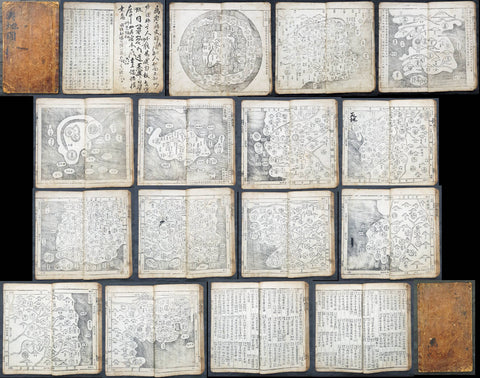
18th Century Rare Antique Ch'onha Chido Korean Atlas w/ 13 Maps - Chŏnhado 天下圖
- Title : Ch'onha chido (Korean Atlas of the World) 天下圖
- Date : Late 18th Century
- Size: 4to - 30.5cm x 19cm (12in x 7 1/2in)
- Condition: (A+) Fine Condition
- Ref: 50402
Description:
We are incredibly excited to be able to offer this rare original antique wood-block engraved late 18th century Ch'onha chido (Atlas of the World) a traditional Korean Atlas, containing 13 maps (World, China, Korea, Japan, Ruyku Islands & 8 provincial maps)
Mostly, such an atlas contains either hand drawn manuscript maps or rarer woodcut engraved maps, such as this atlas (woodcut maps are rarer due to the lack and expense of printing presses and the relatively cheap cost of local scribes)
These atlases were issued by the Korean authorities in the 18th and 19th centuries and possibly earlier to help train each new generation of administrative officers to govern the provinces of their country, and a knowledge of the geography of their own and neighbouring countries was part of that training. They are now all considered to be extremely rare; with a few examples in private hands, the Library of Congress Asian map collections and in some national map collections around the world.
The maps of a Ch onha chido are mainly based on maps made during the Chinese Ming Dynasty (1368-1644). The 13 maps, listed below, are engraved onto fine but strong Mulberry paper with a deep heavy impression in the original black & white. The atlas measures 30.5cm x 19cm (12in x 7 1/2in) with each map page measuring 33.5cm x 30.5cm (13 1/2in x 12in).
The maps are:
1. World Map ( Chŏnhado ) 天下圖
2. China (Chunggukto) 中國圖
3. Korea (Ilbonguk) 日本國
4. Ryukyu (Yuguguk) 琉球國
5. Japan (Tongguk palto taechongdo) 東國八道大總圖
6. Kyŏnggi-do - Chungchŏng-do 京畿道
7. Chŏlla-do 忠清道
8. Kyŏngsang-do 全羅道
9. Hwanghae-do 慶尚道
10. Pyŏngan-do 黄海道
11. Kangwŏn-do 平安道
12. Hamgyŏng-do. 江原道
13. 咸鏡道.
General Definitions:
Paper thickness and quality: - Light and stable
Paper color : - off white
Age of map color: -
Colors used: -
General color appearance: -
Paper size: - 33.5cm x 30.5cm (13 1/2in x 12in). each
Plate size: - 33.5cm x 30.5cm (13 1/2in x 12in). each
Margins: - Min 1/2in (12mm)
Imperfections:
Margins: - Light soiling
Plate area: - Light soiling
Verso: - Light soiling
Background:
The design of 12 of the 13 maps, from a western perspective, are easily recognisable but when we come to the circular World Map or The Cheonhado (Map of the world beneath the heavens) the design is more reminscent of much early middle aged world map, such as the Hereford Mappa Mundi that centered on the Holy Land. This World map centers on China and Korea, with Asia and Africa included to the south and west and the rest of the world included as a separate, encompassing ring.
This form of circular world map was developed in Korea during the 17th century. It is based on the Korean term for map, jido, translated roughly as land picture.
The Cheonhado maps were made in response to the encounter with the geographical knowledge of the West, but based in content on traditional Asian sources and Asian in style. The structure of the maps consists of an internal continent with historical place names, an internal sea with place names connected to descriptions of Taoist immortality, an external continent, and an external sea. Surprisingly, the maps did not reflect the highest levels of geographic knowledge available to Koreans, but this is not likely to be intentional. Some of this was due to the nautical distance between Korea and other East Asian locales affected the mapmakers perceptions of Asia. Similarly, European mapmakers of the day often treated Korea as an island.
Some scholars have attributed the development of Korean circular world maps to Western influence, such as the maps of Matteo Ricci (Kunyu Wanguo Quantu) or the maps of Giulio Aleni (Wanguo Quantu). In this case, the central landmass can be viewed as a combination of Asia, Africa, and Europe, and the external ring continent as North America & South America and the great Southern Lands.
Such maps were produced in Korea only, and have not been found in China or Japan.
The Cheonhado remained popular in Korea until the late 19th century.
Korean Cartography
Koreans have been making and using maps for more than fifteen centuries. Since most of their country's borders were naturally determined by the sea, they had a general concept of Korea's outline at an early date, and their deep consciousness of samch olli kangsan (three thousand Ii of mountains and rivers) gave their mapmakers a general idea of what went within that outline. Underlying these imprints on the national psyche were a strong tradition of administrative and cultural geography and a nationally conceived theory of geomantic analysis. All these factors contributed to the production of interesting maps. While naturally emphasizing their own country, Korean cartographers also showed an enduring interest in the shape of their neighbours' lands and territories; and looking beyond these to the greater world, they produced several carefully studied world maps as well as more traditional cosmographies. Just as Korea's culture freely absorbed many of the features and institutions of Chinese civilization yet retained a strong individual Korean identity, so too Korea's mapmakers, applying general cartographic norms developed in China, adapted these norms to their own circumstances and created maps of both utility and beauty. That much said, by East Asian standards the 'antiquity of Korea's surviving cartographic artifacts is not great. As in other countries, time, war, and carelessness have taken a heavy toll on all written artifacts, but especially on paintings and maps. The oldest Korean map to survive today is an important world map dated 1402 (known in three copies, of which the earliest was made around 1470). But even that date is early in terms of the surviving cartographic corpus taken as a whole, which dates mostly from the sixteenth to the nineteenth century. For maps before 1402, we must rely on written records and reasonable inferences that can be based on the general trends of East Asian and Korean cultural history. An inquiry along these lines will show that whereas mapmaking before 1402 emphasized the nation and its local districts, a twelfth-century scholar had already produced a map of the world along Buddhist lines, and a fourteenth-century man had compiled a historical map of Korea and China. The description of the latter is conceived in terms very similar to those evident in the 1402 world map and provides an appropriate link from the unseen to the visible corpus. It seems convenient to organize Korean maps into four broad categories, proceeding from the more general world and national maps to the more particular regional and local ones. Although this scheme will involve a few chronological discontinuities, the existing corpus is such that most of the more interesting world maps appear relatively early, whereas the great majority of local and topical maps come from the later centuries.The category of world maps is very heterogeneous, including a few genuine maps of the world, a great variety of East Asian regional maps, and the numerous prints and copies of the quasi-cosmographical ch'onhado. Korean scholars sometimes use this term, which can be broadly translated "world maps," for this whole group, but in this chapter it will be reserved for the popular and generally recent maps, often with the terms ch'onha or ch'onhado in their titles, that present the Sinocentric world-China, Korea, and their proximate East Asian neighbours-surrounded by peripheral rings of exotic or mythical lands and peoples. The origin and development of the ch'onhado presents many problems on which scholars still have their differences, but there is no disagreement on the great vogue these maps enjoyed during the eighteenth and nineteenth centuries. They easily account for most of the world map category. Although in terms of the development of maps they are late and perhaps better explained in terms of folklore than of science, still they had a real place in Korean life and have their own absorbing story to tell. The cartographically more significant world maps and East Asian regional maps, though less numerous, have infinitely more variety than the ch'onhado, and they generally come earlier. The phrase samch'olli kangsan has long been a pan of Korean folklore. The significance of "mountains and streams" in Korean national geomantic theory is evident as early as the tenth century.
Then there were maps of Korea alone, understandably a large and varied category. The oldest cartographic depiction of the country to survive is the representation of Korea on the 1402 world map, although we have a number of written references to earlier national maps, including one interesting description of a map of Korea said to have been made in the twelfth century or earlier. During the fifteenth century there was an abundance of geographic research, but unfortunately none of the many maps known to have been produced in that period seem to have survived to modern times. However, a map completed in 1463 by Chong Ch'ok had great influence and is believed to have been taken as a model by later mapmakers, so that we have a reasonably good idea of how the peninsular outline was conceived as well as of the cartographic detail involving rivers and mountains, placenames, and other features. During the early eighteenth century the mapmaker Chong Sanggi and his family achieved a genuine revolution in cartographic technique, producing a dramatically improved understanding of the nation's borders, both the long coastlines and the much harder to grasp northern frontier. These techniques were refined and perfected by the nineteenth-century master Kim Chongho, who was both a mapmaker and a publisher and popularizer. Although he was familiar with Western mapmaking techniques and made use of geodetic coordinates in his work, the visual appearance of his late traditional maps stayed completely within the evolutionary lines of native cartographic practice. Korea's shift to the styles and methods of Western cartography occurred only toward the end of the nineteenth century, as the nation struggled to come to terms with a new Western world order led (as far as Korea was concerned) by Japan, which was much more threatening than reassuring. Provincial maps were popularized in the late fifteenth century as part of an important compendium of administrative geography, and they achieved high levels of quality in the eighteenth century, when Chong Sanggi made maps of all the provinces on a unified scale, so that they could be used as separate maps or combined to make a single national map. Reforms introduced in 1791 promoted extensive local surveys and were a key impetus both to the mapping of counties and towns and to the compilation of local histories. But whereas national and provincial maps came to achieve a certain level of standardization and cartographic professionalism, town and county maps were made by a great variety of local hands, some very skilled, others quite crude. As we shall see, the background of these country mapmakers was more in painting and drawing than in cartography, and the results are evident in hundreds of local maps that might also pass for bird's-eye-view landscapes, a style that is Cartography in Korea, Japan, and Vietnam also well documented for China. The last of the four major categories of Korean maps is the so-called defense map, or kwanbangdo in the traditional term. These range from long scrolls representing frontiers thousands of Ii long and reaching far beyond Korea to maps of local mountain fortresses. The variety is very great. Many were mounted on screens that probably stood in the offices of defense officials in Seoul or provincial governors; others were in more portable scrolls or folios that were an essential part of the equipment of frontier commanders and military officers. One very interesting variety of defense map was oriented to coastal defense and navigation. The evident purpose of maps in this category was principally to clarify terrain and communications from a military perspective, while cartographic scale, so important in the later national and provincial maps, is decidedly a lower priority. The considerable skill and painterly talent evident in these maps shows that they were mostly made and used in the central government or high military commands, where the resources for maintaining staff artists and mapmakers were readily available. (Cartography in Korea - Gari Ledyard)
1907-10 George Philip Large Early London Underground Map
- Title : The Evening News London "Tube Map"
- Date : 1907-10
- Size: 24in x 20in (610mm x 510mm)
- Condition: (A) Very Good Condition
- Ref: 27100
Description:
This original folding lithograph London Underground Antique Map was designed by the London Geographical Institute & printed by George Philip & Son for the Evening News, London between 1907 to 1910. On the verso is the London Tram Map.
The Evening News London Tube map & Guide ran from 1907-1910. At its release in 1907 it predated the first official 'unified' London Underground map (published in 1908). The EN Tube map was the first to refer to the wider network of Underground Railways as the 'Tube'; it was among the first to apply colour-coding for the lines and is widely believed to be the origin of the name 'Bakerloo' for the Baker Street & Waterloo Railway.
This map design would later be used as a basis for the official London Underground Railways pocket map in 1912.
General Definitions:
Paper thickness and quality: - Heavy and stable
Paper color : - off white
Age of map color: - Original
Colors used: - Blue, red, yellow, purple, green
General color appearance: - Authentic
Paper size: - 24in x 20in (610mm x 510mm)
Plate size: - 24in x 20in (610mm x 510mm)
Margins: - Min 1/2in (12mm)
Imperfections:
Margins: - Creasing in margings
Plate area: - Light wear along folds
Verso: - Light wear along folds
Background:
As Londons early transport system was operated by a variety of independent companies, there were no complete maps of the network, just for the individual companies routes. The maps were not typically schematic and were simply the line overlaid on a regular city map. There was no integration of the companies services or any co-operation in advertising.
In 1907, The Evening News commissioned a pocket map, The Evening News London Tube Map. It was the first map to show all of the lines with equal weight being given to each line, and it was the first map to use a different colour for each line.
Another early combined map was published in 1908 by the Underground Electric Railways Company of London (UERL) in conjunction with four other underground railway companies that used the Underground brand as part of a common advertising factor.
The map showed eight routes – four operated by the UERL and one from each of the other four companies:
UERL lines:
Bakerloo Railway – brown
Hampstead Railway – indigo
Piccadilly Railway – yellow
District Railway – green
Other lines:
Central London Railway – blue
City and South London Railway – black
Great Northern and City Railway – orange
Metropolitan Railway – red
A geographical map presented restrictions since for sufficient clarity of detail in the crowded central area of the map required the extremities of the District and Metropolitan lines to be omitted and so a full network diagram was not provided. The problem of truncation remained for nearly half a century. Although all of the western branches of the District and Piccadilly lines were included for the first time in 1933 with Harry Becks first proper Tube map, the portion of the Metropolitan line beyond Rickmansworth did not appear until 1938, and the eastern end of the District line did not appear until the mid-1950s.
The route map continued to be developed and was issued in various formats and artistic styles until 1920, when, for the first time, the geographic background detail was omitted in a map designed by MacDonald Gill. That freed the design to enable greater flexibility in the positioning of lines and stations. The routes became more stylised but the arrangement remained, largely, geographic in nature. The 1932 edition was the last geographic map to be published before Becks diagrammatic map was introduced.
The first diagrammatic map of Londons rapid transit network was designed by Harry Beck in 1931. He was a London Underground employee who realised that because the railway ran mostly underground, the physical locations of the stations were largely irrelevant to the traveller wanting to know how to get from one station to another; only the topology of the route mattered. That approach is similar to that of electrical circuit diagrams although they were not the inspiration for Becks map. His colleagues pointed out the similarities, however, and he once produced a joke map with the stations replaced by electrical circuit symbols and names, with terminology such as Bakerlite for the Bakerloo line.
To that end, Beck devised a simplified map with stations, straight-line segments connecting them, and the River Thames; and lines running only vertically, horizontally, or on 45° diagonals. To make the map clearer and to emphasise connections, Beck differentiated between ordinary stations, marked with tick marks, and interchange stations, marked with diamonds. London Underground was initially sceptical of his proposal since it was an uncommissioned spare-time project and was tentatively introduced to the public in a small pamphlet in 1933. However, it immediately became popular, and the Underground has used topological maps to illustrate the network ever since.
Despite the complexity of making the map, Beck was paid just ten guineas for the artwork and design of the card edition (five guineas for the poster). After its initial success, he continued to design the Tube map until 1960, a single (and unpopular) 1939 edition by Hans Scheger being the only exception. Meanwhile, as well as accommodating new lines and stations, Beck continually altered the design, such as changing the interchange symbol from a diamond to a circle and altering the line colours of the Central line from orange to red and of the Bakerloo line from red to brown. Becks final design, in 1960, bears a strong resemblance to the current map. Beck lived in Finchley, North London, and one of his maps is still preserved on the southbound platform at Finchley Central station, on the Northern line.
In 1997, Becks importance was posthumously recognised, and as of 2021, this statement is printed on every Tube map: This diagram is an evolution of the original design conceived in 1931 by Harry Beck.
1908 UERL Johnson & Riddle Antique London Underground Map Rare 2nd Map Published
- Title : London Underground Railways
- Ref #: 17054
- Size: 13 3/4in x 11 1/2in (352mm x 290mm)
- Date : 1908
- Condition: (A+) Fine Condition
Description:
This original early scarce antique folding, pocket map of The London Underground, only the second combined map, by The Underground Electric Railways Company of London (UERL) was published by Johnson, Riddle & co. in 1908.
The first map was published a year earlier by The Evening News in 1907.
This geographic paper edition of the Underground map shows the Railway lines belonging to the Underground Group as well as the Central London Railway and Metropolitan Railway lines. Each line is represented by a different colour, other railways are marked with lighter black lines, London United tramways are shown by lines of crosses and other tramways routes are marked with a broken line. General geographic features such as roads and parks are also included. Earl's Court Exhibition Ground is marked on this map as well as the Franco-British Exhibition at Shepherd's Bush. This map has a green border and the UndergrounD logo is used in the map title.
General Definitions:
Paper thickness and quality: - Heavy and stable
Paper color : - off white
Age of map color: - Original
Colors used: - Yellow, green, blue, pink
General color appearance: - Authentic
Paper size: - 13 3/4in x 11 1/2in (352mm x 290mm)
Plate size: - 13 3/4in x 11 1/2in (352mm x 290mm)
Margins: - Min 1/8in (2mm)
Imperfections:
Margins: - Folds as issued
Plate area: - Folds as issued
Verso: - Folds as issued
Background:
As Londons early transport system was operated by a variety of independent companies, there were no complete maps of the network, just for the individual companies routes. The maps were not typically schematic and were simply the line overlaid on a regular city map. There was no integration of the companies services or any co-operation in advertising.
In 1907, The Evening News commissioned a pocket map, The Evening News London Tube Map. It was the first map to show all of the lines with equal weight being given to each line, and it was the first map to use a different colour for each line.
Another early combined map was published in 1908 by the Underground Electric Railways Company of London (UERL) in conjunction with four other underground railway companies that used the Underground brand as part of a common advertising factor.
The map showed eight routes – four operated by the UERL and one from each of the other four companies:
UERL lines:
Bakerloo Railway – brown
Hampstead Railway – indigo
Piccadilly Railway – yellow
District Railway – green
Other lines:
Central London Railway – blue
City and South London Railway – black
Great Northern and City Railway – orange
Metropolitan Railway – red
A geographical map presented restrictions since for sufficient clarity of detail in the crowded central area of the map required the extremities of the District and Metropolitan lines to be omitted and so a full network diagram was not provided. The problem of truncation remained for nearly half a century. Although all of the western branches of the District and Piccadilly lines were included for the first time in 1933 with Harry Becks first proper Tube map, the portion of the Metropolitan line beyond Rickmansworth did not appear until 1938, and the eastern end of the District line did not appear until the mid-1950s.
The route map continued to be developed and was issued in various formats and artistic styles until 1920, when, for the first time, the geographic background detail was omitted in a map designed by MacDonald Gill. That freed the design to enable greater flexibility in the positioning of lines and stations. The routes became more stylised but the arrangement remained, largely, geographic in nature. The 1932 edition was the last geographic map to be published before Becks diagrammatic map was introduced.
The first diagrammatic map of Londons rapid transit network was designed by Harry Beck in 1931. He was a London Underground employee who realised that because the railway ran mostly underground, the physical locations of the stations were largely irrelevant to the traveller wanting to know how to get from one station to another; only the topology of the route mattered. That approach is similar to that of electrical circuit diagrams although they were not the inspiration for Becks map. His colleagues pointed out the similarities, however, and he once produced a joke map with the stations replaced by electrical circuit symbols and names, with terminology such as Bakerlite for the Bakerloo line.
To that end, Beck devised a simplified map with stations, straight-line segments connecting them, and the River Thames; and lines running only vertically, horizontally, or on 45° diagonals. To make the map clearer and to emphasise connections, Beck differentiated between ordinary stations, marked with tick marks, and interchange stations, marked with diamonds. London Underground was initially sceptical of his proposal since it was an uncommissioned spare-time project and was tentatively introduced to the public in a small pamphlet in 1933. However, it immediately became popular, and the Underground has used topological maps to illustrate the network ever since.
Despite the complexity of making the map, Beck was paid just ten guineas for the artwork and design of the card edition (five guineas for the poster). After its initial success, he continued to design the Tube map until 1960, a single (and unpopular) 1939 edition by Hans Scheger being the only exception. Meanwhile, as well as accommodating new lines and stations, Beck continually altered the design, such as changing the interchange symbol from a diamond to a circle and altering the line colours of the Central line from orange to red and of the Bakerloo line from red to brown. Becks final design, in 1960, bears a strong resemblance to the current map. Beck lived in Finchley, North London, and one of his maps is still preserved on the southbound platform at Finchley Central station, on the Northern line.
In 1997, Becks importance was posthumously recognised, and as of 2021, this statement is printed on every Tube map: This diagram is an evolution of the original design conceived in 1931 by Harry Beck.
The Underground Electric Railways Company of London Limited (UERL)
The Underground Electric Railways Company of London Limited (UERL), known operationally as the Underground for much of its existence, was established in 1902. It was the holding company for the three deep-level tube underground railway lines opened in London during 1906 and 1907: the Baker Street and Waterloo Railway, the Charing Cross, Euston and Hampstead Railway and the Great Northern, Piccadilly and Brompton Railway. It was also the parent company from 1902 of the District Railway, which it electrified between 1903 and 1905. The UERL is a precursor of today's London Underground; its three tube lines form the central sections of today's Bakerloo, Northern and Piccadilly lines.
The UERL struggled financially in the first years after the opening of its lines and narrowly avoided bankruptcy in 1908 by restructuring its debt. A policy of expansion by acquisition was followed before World War I, so that the company came to operate the majority of the underground railway lines in and around London. It also controlled large bus and tram fleets, the profits from which subsidised the financially weaker railways. After the war, railway extensions took the UERL's services out into suburban areas to stimulate additional passenger numbers, so that, by the early 1930s, the company's lines stretched beyond the County of London and served destinations in Middlesex, Essex, Hertfordshire and Surrey.
In the 1920s, competition from small unregulated bus operators reduced the profitability of the road transport operations, leading the UERL's directors to seek government regulation. This led to the establishment of the London Passenger Transport Board in 1933, which absorbed the UERL and all of the independent and municipally operated railway, bus and tram services in the London area.
1912 GW Bacon Antique Bespoke World Map with Global Steamship & Railway Routes
- Title : Nightingales New Library & Route Chart of the World.....Copyright....London GW Bacon
- Size: 49in x 38in (1.24m x 965mm)
- Condition: (A+) Fine Condition
- Date : 1912
- Ref #: 33667
Description:
This one-off (bespoke) original antique lithograph wall map of the world on Mercators projection was made by George Washington Bacon in 1912.
Bacon was famous for his one-off bespoke maps and this individual wall map, depicting the World Steamship & Railroad routes, was published just prior to WWI in London.
General Definitions:
Paper thickness and quality: - Heavy and stable
Paper color : - off white
Age of map color: - Original
Colors used: - Yellow, green, blue, pink
General color appearance: - Authentic
Paper size: - 49in x 38in (1.24m x 965mm)
Plate size: - 49in x 38in (1.24m x 965mm)
Margins: - Min 1/2in (12mm)
Imperfections:
Margins: - Top of map partially separated from the top roller
Plate area: - Small scuff off the east coast of Greenland
Verso: - None
Background:
There are a few of Bacons bespoke maps that have survived and are today quite highly sort after and because of their individuality can sell for well over $1500US.
Bacons was well known for his cartographic prowess but followed firms such as Smith, Praed & Sifton and Edward Stanford making one-off bespoke map their raison d etre.
Bacon, George Washington 1830 - 1922
Bacon was a map-maker and seller. His company was based in London in the late 19th century and early 20th century. He specialised in rail and road maps, for cyclists at first, and later for early motorists too. He used old Ordnance Plates either directly or via Edward Wellers steel plates, which he reduced to 1/2 to the mile or smaller and added his own graphic for the railways.
He was born in Lockport, New York in the United States of America. He died as late as 1922, having lived to the age of 92. He based his printing and cartographic business in London and, on his maps one finds two addresses:
Bacon operated as G.W. Bacon & Co. of 127 in the Strand, London, from 1870 onwards (as an independent cartographer) but later maps carry the address: Norwich Street, Fetter Lane, London (when owned by the parent company Johnston of Edinburgh). Some sources state that he moved to England in 1860 or 1861.
To begin with he concentrated on maps of the capital and his business grew naturally as an extension of travellers needs to and from London. Another of his early enterprises was the production of maps and battle plans for those interested in the course of the American Civil War.
His many early enterprises gain him no great success and in 1867 he was bankrupt. Following that he concentrated on map making.
He also produced atlases and the base maps for these came from Edward Wellers Weekly Dispatch Atlas. Of course Weller was not a surveyor- and the ultimate base maps were early Ordnance 1 inch plates. He was not pirating Wellers plates but had managed to purchase them- they were steel- the medium of choice for mass publication of intaglio- where as other engravers of Wellers time, such as Walker, had been faithful to copper.
Bacons chef doeuvre was The New Ordnance Atlas of the British Isles published from 1868 to 1911. The reason it ended in 1911 was that, in that year, the Ordnance Survey tightened up considerably on copyright and licenced use of its maps under stricter conditions, notably: that the scale be changed: that their sanction be stated on the map sheet, and: that the words Ordnance or Ordnance Survey were not used in the title or on the cover. It was in 1911 that Bartholomew also had to retitle his maps as New Reduced Surveys to comply with the new rules and did so with considerable bad grace because he and others considered the Ordnance Survey to be a publicly funded body which should not enforce copyright. By this 1911 date Bacon maps were owned by Johnstons of Edinburgh and had been since the turn of the century.
In 1893 George W Bacon purchased the cartographical business of J. Wyld, through whom he obtained a library of map plates of London.
In 1900, the Bacon Company was purchased itself by another Edinburgh cartographer: W. & A.K. Johnston, who continued to print the maps as G. W. Bacon. Johnston were the first company to concentrate primarily on the motor map and they used G. W. Bacon as a house marque as late as 1956.
G.W. Bacons links with Scottish cartographers was strong and later maps, produced when under the control of Johnston of Edinburgh, can bear the copyright of John Bartholomew, so it is evident that there was much exchange of material and co production amongst the cartographers of that city- notably Bartholomew, Gall and Inglis and Johnston.
Generally, Bacon might be seen in the same light at Gall and Inglis, and Cruchley: printers who noticed that the Ordnance map was expensive and conservative and that, in the late 19th century, there was a growing body of travellers and adventurers who which to purchase a guide map without paying OS prices. They also needed a map which was of a format compatible with cycling or train travel.
Ordnance maps were, in the 19th century, directed by senior officers of the Royal Engineers-usually Lieutenant-Colonels- and engraved and printed first at the Tower of London and then at Southampton. Though fine as cartography- their raison detre was military and those sold to the general public were usually ordered, bespoke from firms such as Smith, Praed & Sifton and Edward Stanford, who would dissect, mount on best linen, and board in marbled boxed covers. This was not a railway book-shop trade and thus the commercial vacuum created was filled by Cruchley first and Bacon later.
Bacon maps were either paper or linen backed. I have not seen them dissected and mounted. There is an ambiguity about his cycle maps because the base survey is often 70 years earlier than the suggested roads and one is looking at a triple layered print. Late Georgian perhaps for the base map, 1870s for Bacons railways and nearer 1900 for the suggested cycle roads. Obviously those suggested routes do not always fit the roads of the base map and this mismatch provides a deal of accidental data about how transport changed through the 19th century.
The railways are usually marked with a ladder like Graphic. The stations are generally added as a black dot and named in Bacons bold black script; this is different to the script of the base map. In some cases the Ordnance place names are underlined if they coincide with a station: but the interest here is how seldom that occurred- and one notices, through Bacons publications, how the 19th century railways ill served towns and villages, and how urban growth migrated to the railways rather than railways serving the towns. The OS added railways when their plates were electrotyped. This began in 1852 but the more general date one sees for an OS electrotype of the 1 inch series is 1870-1878. Thus, it may be seen that George Bacon must have been using base plates prior to this period.
On the later maps, when Johnston owned the company- Bacon maps experiment with MOT road numbers- usually they are used without a letter prefix (A, B, T). The MOT experimented with road numbering in 1913- abandoned the project, and then re-instigated it after the Great War, in 1919.
There is an interesting link between George W Bacon and the Temperance Movement. Cycling must have been seen as one of the tools though which the working people of the great industrial towns could be tempted away from a culture of drinking. Bacon Maps often had advertising by Frys (Cocoa), and hoteliers such as Tranters (Temperance Hotels). In the Cyclists Touring Club guides about 50% of the recommended hotels and guest houses were temperance institutions. Frys and the other great confectionery families were Quaker and strong backers of the movement.
Early Bacon Cycle map covers show Victorian cyclists and a motto and verso advertisement links that image with the Imperial Rover Cycle. Later Cycle maps often show a generic image of a distant town with smoking chimneys, a lady studying her map by her bicycle and, in the middle ground, a sports cyclist. A milepost announces 4 miles. The image demonstrates the market: industrial working people, escaping their urban homes to explore the countryside. Later, on these maps and on later 1920s ones, a motor car is added to the background. Cartographers are aware of impending change; but the maps within the covers call themselves Cycling Surveys still, and none of their features seem particularly relevant to the early motorist.
Another standard advertisement seen in Bacon maps is that for Cross Channel traffic via Newhaven by Brighton and French State Railways: a photograph shows a car being winched aboard a ferry at Newhaven. Presumably the Brighton Railway means the L.B.S.C.R.
Later still, road maps are for Motoring and Cycling and the scale reduced to ¼ inch to the mile. On these maps, which are from the period when Johnston owned the firm, the copyright at bottom right cites John Bartholomew and Son, Edinburgh: so presumably Johnston and Bartholomew were working together and perhaps conspiring to circumvent the 1911 Ordnance copyright restrictions.
Bacon Maps were often bespoke produced for a local retailer- usually a bookseller or stationer in a rural town, who had his town central to the map and concentric 1 or 2 mile rings drawn from it to aid the tourer or cyclist. Gall and Inglis also used this device. On these maps, railways were always prominent. The implication is that the cyclist arrived by train and perhaps used the train to take his/her machine to the start point of the cycle tour. It is interesting that the chosen roads do not generally run to the coastal resorts- sometimes these are avoided; the implication is that the cycle tourer was of a different stratum of society to the resort holiday-maker and interested in different things: old churches, castles, historic towns, ancient sites and picturesque villages. Perhaps the Temperance bias of Bacon and his advertisers saw the seaside resort as a inadvisable temptation rather than a boon.
1930 Commercial Press Large Antique Map of Hangzhou, West Lake China - Very Rare
- Title : Map of Hangchow and West Lake and Environs... Commercial Press Ltd
- Date : 1924
- Condition: (A) Very Good Condition
- Ref: 40172
- Size: 43in x 31in (1.090m x 790mm)
Description:
This very large, rare original antique folding map of the Chinese city of Hangzhou, West Lake & the Qiantang River was published by the Chinese publishing house Commercial Press LTD in the 13th Year of the Chinese Republic, October 1924.
General Definitions:
Paper thickness and quality: - Heavy and stable
Paper color : - off white
Age of map color: - Original
Colors used: - Yellow, green, blue, pink
General color appearance: - Authentic
Paper size: - 43in x 31in (1.090m x 790mm)
Plate size: - 43in x 31in (1.090m x 790mm)
Margins: - Min 1/2in (12mm)
Imperfections:
Margins: - None
Plate area: - Folds as issued, slight loss in corner folds
Verso: - Folds re-enforced with archival tape
Background:
Hangzhou is the capital and most populous city of Zhejiang Province in East China. It sits at the head of Hangzhou Bay, which separates Shanghai and Ningbo. Hangzhou grew to prominence as the southern terminus of the Grand Canal and has been one of the most renowned and prosperous cities in China for much of the last millennium.
The city remained an important port until the middle of the Ming dynasty era, when its harbor slowly silted up. Under the Qing, it was the site of an imperial army garrison.
In 1856 and 1860, the Taiping Heavenly Kingdom occupied Hangzhou. The city was heavily damaged during its conquest, occupation, and eventual reconquest by the Qing army.
Hangzhou was ruled by the Republic of China government under the Kuomintang from 1927 to 1937 and 1945 to 1949. On May 3, 1949, the Peoples Liberation Army entered Hangzhou and the city came under Communist control. After Deng Xiaopings reformist policies began in the end of 1978, Hangzhou took advantage of being situated in the Yangtze River Delta to bolster its development. It is now one of Chinas most prosperous major cities.
West Lake is a freshwater lake in Hangzhou, China. It is divided into five sections by three causeways. There are numerous temples, pagodas, gardens, and artificial islands within the lake.
The earliest recorded name for West Lake was the Wu Forest River (Wǔlín Shuǐ). The Book of Hans Geography Column says, Qiantang, affiliated to the western governor general. Wu Forest Mountain (Wǔlínshān) is the origin of the Wu Forest River. Running east into the sea, it covers 830 li (roughly, 350 km or 220 mi). Other former names include the Qian River, Qiantang Lake, Mingsheng Lake, Jinniu Lake, Shihan Lake, Shang Lake, Lianyan Lake, Fangsheng Pond, Xizi Lake, Gaoshi Lake, Xiling Lake, Meiren Lake, Xianzhe Lake, and Mingyue Lake. But only two names were widely accepted in history and recorded in historical documents. One is Qiantang Lake, due to the fact that Hangzhou was called Qiantang in ancient times. The other name is West Lake, due to the lake being west of the city. The name West Lake first appeared in two poems of Bai Juyi, Bestowed on guests as returning from West Lake in the evening and looking back to Gushan Temple (西湖晚歸回望孤山寺贈諸客) and On the returning boat to Hangzhou (杭州回舫). Since the Northern Song dynasty, most poems and articles of scholars used the name West Lake, while the name Qiantang Lake was gradually deprecated. The request of dredging West Lake written by Su Shi was the first time that West Lake appeared in an official document.
The Commercial Press 1897 - Present
The Commercial Press is the first modern publishing organisation in China. In 1897, 26-year-old Xia Ruifang and three of his friends founded The Commercial Press in Shanghai. The group soon received financial backing and began publishing books.[1] In 1914, Xia attempted to buy out a Japanese company that had invested in the Commercial Press. Four days later he was assassinated. There was much speculation as to who was behind the assassination; no one was ever arrested for the crime.
Commercial Press was bombed by the Imperial Japanese Army during the January 28 Incident. The bombing destroyed its headquarters in Zhabei, Shanghai, as well as the attached East Library and its collection of tens of thousands of rare books.
At the turn of the century Commercial Press became a major publisher of textbooks. Today it is headquartered in Beijing and continues as an active publishing house of Chinese language learning materials including dictionaries, textbooks, pedagogical texts, and a cultural magazine called The World of Chinese.
Timeline:
1902 it was set up with a forward attitude toward both Chinese and Western studies.
1903 it became Chinas first primary education textbook publisher. It later produced 2,550 secondary school textbooks that became popular in the country.
1904 it launched the Eastern Miscellany (東方雜誌) with editor-in-chief (杜亞泉).
1907 the press moved to an 80-acre (320,000 m2) new plant.
1909 it launched the Education Magazine (教育雜誌).
1910 it launched The Short Story Magazine (小說月報).
1911 it launched the Youth Magazine (少年雜誌).
January 1914, the founder of Commercial Press, Xia Ruifang, was stabbed to death.
1914 it set up a branch in Hong Kong Museum of the same year. It also launched the Students Magazine (學生雜誌).
1915 it printed the first dictionary.
1916 it set up a branch in Singapore.
1921 with Hu Shihs recommendation, Wang Yunwu (王雲五) became the general manager modernising it into a business. The first edition of Zhongguo renming dacidian was published.
1924 it opened the Commercial Press Oriental Library.
28 January 1932, the January 28 Incident occurred. The Japanese aircraft bombed the Commercial Press in conjunction with the Oriental Library. Imperial Japanese army would occupy Shanghai the next day. TCP resumed operation in 1932.
1949, TCPs operation was relocated away from China after Liberation Army had entered Shanghai.
1954, the TCPs headquarter was moved from Shanghai to Beijing shifting the focus to academic works published in the West.
1993, the separate Commercial Press companies in China, Hong Kong, Taiwan, Singapore, and Malaysia established a joint venture to become The Commercial Press International Limited.
2011, the Beijing office was changed into limited liability company (商务印书馆有限公司).
When China publishing and Media Holdings Co.,Ltd. (中国出版传媒股份有限公司) was founded in 2011-12-19, the newly founded company became the parent company.
1930 Evan Gill Antique Map of Missions in PNG - Brother to Eric & MacDonald Gill - Unique
- Title : The Territory of Papua Eastern Portion shoqing the Stations of The Anglican Missions...Evan R Gill 1930.
- Size: 34in x 19in (865mm x 485mm)
- Condition: (A+) Fine Condition
- Date : 1930
- Ref #: 92580
Description:
This unique manuscript original antique map of Papua New Guinea ,and the Stations of the Anglican Missions in the eastern portion of the country, was drawn by Evan Robertson Gill, brother of the Arts and Crafts artist Eric Gill and map-maker Macdonald - Max - Gill in 1930 - dated.
The maps is also signed and addressed on the verso of the map by Evan.
This map was purchased a number of years ago but its significance only became apparent later with the direct connection to Evans (in)famous brother Eric and his equally well known brother MacDonald Gill, known as Max, and his famous map of the London Underground map known as the Wonderground Map.
Our research has been unable to find any other maps by Evan but we were understandably excited once the connection was made to his three brothers from the artistic and PNG missionary connection.
The map must have been commissioned by Evans brother Archdeacon Stephen Romney Gill, missionary in PNG during the first half of the 20th century, who famously survived in the Lae area of New Guinea, near the Kokoda trail, during the occupation of PNG by the Japanese in 1942/3.
General Definitions:
Paper thickness and quality: - Heavy and stable
Paper color : - off white
Age of map color: -
Colors used: -
General color appearance: -
Paper size: - 34in x 19in (865mm x 485mm)
Plate size: - 34in x 19in (865mm x 485mm)
Margins: - Min 1/4in (5mm)
Imperfections:
Margins: - Repairs to tears in left margin, no loss
Plate area: - None
Verso: - Repairs to tears in left margin, no loss
Background:
Gill, Evan Robertson 1892 - 1968. Gill was born in Brighton England one of thirteen children. His father Arthur Gill was a clergyman with a family background of missionary work in the South Seas. Evan had three well known brothers Eric Gill the (in)famous Arts and Crafts artist, Macdonald Gill (Max) the decorative map maker - famous for designing the 1914 Wonderground Map of the London Underground - and Stephen Romney Gill 1886 - 1954, Anglican Archdeacon in Papua New Guinea in the early 20th century and during the occupation of PNG by the Japanese in 1942/3.
His brothers Stephen & Dr Cecil Gill, were missionaries in Papua New Guinea from 1905 until the 1950s after their Grandfather George Gill & Great Uncle William Gill, both missionaries in the Cook Islands.
Leslie MacDonald Gill 1884 – 1947 commonly known as MacDonald Gill or Max Gill, was a noted early-twentieth century graphic designer, cartographer, artist and architect.
Born in Brighton, Gill was the younger brother of Eric Gill, one of the leading figures of the Arts and Crafts movement.
In 1914 his Wonderground Map, commissioned by Frank Pick, and hung at every station, helped to save the London Underground by presenting an accurate map which also had a humorous side in cartoon style. Produced in poster form, it was also made available for sale to members of the public and proved to be very popular. Elder brother Eric, who at that time was engaged in a commission for Westminster Cathedral, was included at the bottom of the map. Gill showed three works at the first annual exhibition of the newly-formed Society of Graphic Art in 1921.
He was the designer of the standard upper case lettering used on headstones and war memorials by the Imperial War Graves Commission. But it is perhaps his illustrated maps for which he is most well known. These maps have featured in a series of exhibitions including Magnificent Maps exhibition in 2010 at the British Library, an exhibition MacDonald Gill, Out of the Shadows in 2011 at the University of Brighton and at the Mind the Map exhibition in 2012 at the London Transport Museum.
Arthur Eric Rowton Gill 1882 – 1940 was an English sculptor, typeface designer, and print-maker, who was associated with the Arts and Crafts movement. He is a controversial figure, with his well-known religious views and subject matter generally viewed as being at odds with his sexual behaviour.
Gill was born in 1882 in Hamilton Road, Brighton and grew up in the Brighton suburb of Preston Park. One of twelve children, he was the elder brother of MacDonald Max Gill (1884–1947), the graphic artist. In 1897 the family moved to Chichester. He studied at Chichester Technical and Art School, and in 1900 moved to London to train as an architect with the practice of W.D. Caroe, specialists in ecclesiastical architecture.
Frustrated with his training, he took evening classes in stone-masonry at the Westminster Technical Institute and in calligraphy at the Central School of Arts and Crafts, where Edward Johnston, creator of the London Underground typeface, became a strong influence. In 1903 he gave up his architectural training to become a calligrapher, letter-cutter and monumental mason.
Working from Ditchling in Sussex, where he lived with his wife, in 1910 Gill began direct carving of stone figures. These included Madonna and Child (1910), which English painter and art critic Roger Fry described in 1911 as a depiction of pathetic animalism, and Ecstasy (1911). Such semi-abstract sculptures showed Gill\'s appreciation of medieval ecclesiastical statuary, Egyptian, Greek and Indian sculpture, as well as the Post-Impressionism of Cézanne, van Gogh and Gauguin.
His first public success was Mother and Child (1912). A self-described disciple of the Ceylonese philosopher and art historian Ananda Coomaraswamy, Gill was fascinated during this period by Indian temple sculpture. Along with his friend and collaborator Jacob Epstein, Gill planned the construction in the Sussex countryside of a colossal, hand-carved monument in imitation of the large-scale Jain structures at Gwalior Fort in Madhya Pradesh, to which he had been introduced by William Rothenstein.
In 1914 Gill produced sculptures for the stations of the cross in Westminster Cathedral. In the same year he met the typographer Stanley Morison. After the war, together with Hilary Pepler and Desmond Chute, Gill founded The Guild of St Joseph and St Dominic at Ditchling. There his pupils included David Jones, who soon began a relationship with Gills daughter, Petra.
Gill designed several war memorials after the First World War, including the Grade II* listed Trumpington War Memorial. Commissioned to produce a war memorial for the University of Leeds, Gill produced a frieze depicting Jesus driving the money-changers from the temple, showing contemporary Leeds merchants as the money-changers. Gill contended that the money men were a key cause of the war. This is at the Michael Sadler Building at the University.
In 1924, Gill moved to Capel-y-ffin in Powys, Wales, where he established a new workshop, to be followed by Jones and other disciples. In 1928, he set up a printing press and lettering workshop in Speen, Buckinghamshire. He took on a number of apprentices, including David Kindersley, who in turn became a successful sculptor and engraver, and his nephew, John Skelton, noted as an important letterer and sculptor. Other apprentices included Laurie Cribb, Donald Potter and Walter Ritchie. Others in the household included Gills two sons-in-law, Petra\'s husband Denis Tegetmeier and Joanna\'s husband Rene Hague.
In 1928–9, Gill carved three of eight relief sculptures on the theme of winds for Charles Holdens headquarters for the London Electric Railway (now Transport for London) at 55 Broadway, St James. He carved a statue of the Virgin and Child for the west door of the chapel at Marlborough College.
In 1932, Gill produced a group of sculptures, Prospero and Ariel and others for the BBCs Broadcasting House in London. In 1934, Gill visited Jerusalem where he worked at the Palestine Archaeological Museum (now the Rockefeller Museum). He carved a stone bas-relief of the meeting of Asia and Africa above the front entrance together with ten stone reliefs illustrating different cultures and a gargoyle fountain in the inner courtyard. He also carved stone signage throughout the museum in English, Hebrew and Arabic.
Gill was commissioned to produce a sequence of seven bas-relief panels for the façade of The People\'s Palace, now the Great Hall of Queen Mary University of London, which opened in 1936. In 1937, he designed the background of the first George VI definitive stamp series for the post office. In 1938 Gill produced The Creation of Adam, three bas-reliefs in stone for the Palace of Nations, the League of Nations building in Geneva, Switzerland. During this period he was made a Royal Designer for Industry, the highest British award for designers, by the Royal Society of Arts and became a founder-member of the Faculty of Royal Designers for Industry when it was established in 1938. In April 1937, Gill was elected an Associate member of the Royal Academy.
Gills only complete work of architecture was St Peter the Apostle Roman Catholic Church in Gorleston, built in 1938–39.
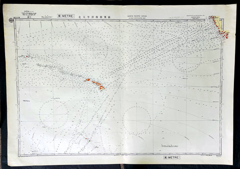
1939 Japanese Safety Agency Large Antique Map of Hawaii, Pacific - Pearl Harbor
- Title : North Pacific Ocean Southern Portion Eastern Sheet, Compiled from the United States and the British Charts to 1939
- Date : 1939
- Size: 43in x 30in (1.090m x 760mm)
- Condition: (A+) Fine Condition
- Ref: 27101
Description:
This original very large lithograph map, a sea chart, with depth soundings, of The Central Pacific, centering on the Hawaiian Islands was complied by the Maritime Safety Agency Japan (MSAJ) from American & British charts. The maps centers on the Hawaiian Islands east to California and south to the Christmas Islands.
The importance of this map cannot be overstated in the context of time and would have no doubt been used by the Japanese carrier group and their attack on Pearl Harbour in 1941.
General Definitions:
Paper thickness and quality: - Heavy and stable
Paper color : - off white
Age of map color: - Original
Colors used: - Blue
General color appearance: - Authentic
Paper size: - 43in x 30in (1.090m x 760mm)
Plate size: - 43in x 30in (1.090m x 760mm)
Margins: - Min 1in (25mm)
Imperfections:
Margins: - None
Plate area: - None
Verso: - None
Background:
The attack on Pearl Harbor was a surprise military strike by the Imperial Japanese Navy Air Service upon the United States against the U.S. naval base at Pearl Harbor in Honolulu, Hawaii, just before 8:00 a.m. (local time) on Sunday, December 7, 1941. The United States was a neutral country at the time; the attack led to its formal entry into World War II on the side of the Allies the next day. The Japanese military leadership referred to the attack as the Hawaii Operation and Operation AI, and as Operation Z during its planning.
The attack was preceded by months of negotiations between the U.S. and Japan over the future of the Pacific. Japanese demands included that the U.S. end its sanctions against Japan, cease aiding China in the Second Sino-Japanese war, and allow Japan to access the resources of the Dutch East Indies. Anticipating a negative response from the US, Japan sent out its naval attack groups in November 1941 just prior to receiving the Hull note—the U.S. demand that Japan withdraw from China and French Indochina.
Japan intended the attack as a preventive action. Its aim was to prevent the United States Pacific Fleet from interfering with its planned military actions in Southeast Asia against overseas territories of the United Kingdom, the Netherlands, and those of the United States. Over the course of seven hours there were coordinated Japanese attacks on the U.S.-held Philippines, Guam, and Wake Island and on the British Empire in Malaya, Singapore, and Hong Kong.
The attack commenced at 7:48 a.m. Hawaiian Time (6:18 p.m. GMT). The base was attacked by 353 Imperial Japanese aircraft (including fighters, level and dive bombers, and torpedo bombers) in two waves, launched from six aircraft carriers. Of the eight U.S. Navy battleships present, all were damaged, with four sunk. All but USS Arizona were later raised, and six were returned to service and went on to fight in the war. The Japanese also sank or damaged three cruisers, three destroyers, an anti-aircraft training ship, and one minelayer. More than 180 US aircraft were destroyed. A total of 2,403 Americans were killed and 1,178 others were wounded, making it the deadliest event ever recorded in Hawaii. Important base installations such as the power station, dry dock, shipyard, maintenance, and fuel and torpedo storage facilities, as well as the submarine piers and headquarters building (also home of the intelligence section) were not attacked. Japanese losses were light: 29 aircraft and five midget submarines lost, and 64 servicemen killed. Kazuo Sakamaki, the commanding officer of one of the submarines, was captured.
Japan announced declarations of war on the United States and the British Empire later that day (December 8 in Tokyo), but the declarations were not delivered until the following day. The British government declared war on Japan immediately after learning that their territory had also been attacked, while the following day (December 8) the United States Congress declared war on Japan. On December 11, though they had no formal obligation to do so under the Tripartite Pact with Japan, Germany and Italy each declared war on the U.S., which responded with a declaration of war against Germany and Italy. There were numerous historical precedents for the unannounced military action by Japan, but the lack of any formal warning (required by part III of the Hague Convention of 1907), particularly while negotiations were still apparently ongoing, led President Franklin D. Roosevelt to proclaim December 7, 1941, a date which will live in infamy. Because the attack happened without a declaration of war and without explicit warning, the attack on Pearl Harbor was later judged in the Tokyo Trials to be a war crime.
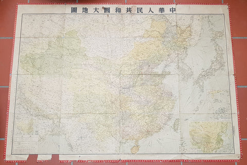
1950 Large Antique Map of the PR China - Ist Map by PRC after Revolution 1949 Rare
- Title : The Great Land and The People of China (Translated)
- Date : 1950
- Condition: (B) Good Condition
- Ref: 93112
- Size: 58 1/2in x 42 1/2in (1.485m x 1.080m)
Description:
This original extremely large very rare folding antique lithograph wall map of the Peoples Republic of China and surrounding countries was published by the Peoples Republic of China in 1950.
Considering the Chinese Communist State was established after the revolution of 1949, this map is one of the earliest, if not the earliest, available map of China released by the communist state and given the secretive nature of the PRC in the 1950s the rarity of this map cannot be overstated.
General Definitions:
Paper thickness and quality: - Heavy and stable
Paper color : - off white
Age of map color: - Original
Colors used: - Yellow, green, blue, pink
General color appearance: - Authentic
Paper size: - 58 1/2in x 42 1/2in (1.485m x 1.080m)
Plate size: - 58 1/2in x 42 1/2in (1.485m x 1.080m)
Margins: - Min 1/2in (12mm)
Imperfections:
Margins: - Loss to bottom sections of margins
Plate area: - Folds as issued
Verso: - Folds re-enforced on verso with archival tape
Background:
Following the Chinese Civil War and victory of Mao Zedongs Communist forces over the Kuomintang forces of Generalissimo Chiang Kai-shek, who fled to Taiwan, Mao declared the founding of the Peoples Republic of China on October 1, 1949. Maos first goal was a total overhaul of the land ownership system, and extensive land reforms. Chinas old system of gentry landlord ownership of farmland and tenant peasants was replaced with a distribution system in favor of poor/landless peasants which significantly reduced economic inequality. Over a million landlords were executed. In Zhangzhuangcun, in the more thoroughly reformed north of the country, most landlords and rich peasants had lost all their land and often their lives or had fled. All formerly landless workers had received land, which eliminated this category altogether. As a result, middling peasants, who now accounted for 90 percent of the village population, owned 90.8 percent of the land. Mao laid heavy theoretical emphasis on class struggle, and in 1953 began various campaigns to persecute former landlords and merchants, including the execution of more powerful landlords. Drug trafficking in the country as well as foreign investment were largely wiped out.
Mao believed that socialism would eventually triumph over all other ideologies, and following the First Five-Year Plan based on a Soviet-style centrally controlled economy, Mao took on the ambitious project of the Great Leap Forward in 1958, beginning an unprecedented process of collectivization in rural areas. Mao urged the use of communally organized iron smelters to increase steel production, pulling workers off of agricultural labor to the point that large amounts of crops rotted unharvested. Mao decided to continue to advocate these smelters despite a visit to a factory steel mill which proved to him that high quality steel could only be produced in a factory. He thought that ending the program would dampen peasant enthusiasm for his political mobilization, the Great Leap Forward.
The implementation of Maoist thought in China may have been responsible for 40–70 million deaths including famine during peacetime, with the Great Leap Forward, Anti-Rightist Campaign of 1957–1958, and the Cultural Revolution. Millions died from both executions and forced labour. Because of Maos land reforms during the Great Leap Forward, which resulted in massive famines, thirty million perished between 1958 and 1961. By the end of 1961 the birth rate was nearly cut in half because of malnutrition. Active campaigns, including party purges and reeducation resulted in the imprisonment or execution of those deemed to hold views contrary to Maoist ideals. Maos failure with the Leap reduced his power in government, whose administrative duties fell to Liu Shaoqi and Deng Xiaoping.
To impose socialist orthodoxy and rid China of old elements, and at the same time serving certain political goals, Mao began the Cultural Revolution in May 1966. The campaign was far reaching into all aspects of Chinese life. Red Guards terrorized the streets as many ordinary citizens were deemed counter-revolutionaries. Education and public transportation came to a nearly complete halt. Daily life involved shouting slogans and reciting Mao quotations. Many prominent political leaders, including Liu and Deng, were purged and deemed capitalist-roaders. The campaign would not come to a complete end until the death of Mao in 1976.
Publishing in the Peoples Republic of China
Publishing in China dates from the invention of woodblock printing around the eighth century A.D. and was greatly expanded with the invention of movable clay type in the eleventh century. From the tenth to the twelfth century, Kaifeng, Meishan, Hangzhou, and Jianyang were major printing centers. In the nineteenth century, China acquired movable lead type and photogravure printing plates and entered the age of modern book and magazine printing. The largest of the early publishing houses were the Commercial Press (Shangwu Yinshuguan), established in 1897, and the China Publishing House (Zhonghua Shuju), established in 1912, both of which were still operating in 1987. Following the May Fourth Movement of 1919, publishers, especially those associated with various groups of intellectuals, proliferated. During the Chinese civil war, New China Booksellers (Xinhua Shudian) published a large amount of Marxist literature and educational materials in the communist-controlled areas. On the eve of the establishment of the People\\\'s Republic in 1949, there were over 700 New China Booksellers offices.
Between 1949 and 1952, the New China Booksellers offices scattered throughout the country were nationalized and given responsibility publishing, printing, and distribution. Also, several small private publishers were brought under joint stateprivate ownership, and by 1956 all private publishers had been nationalized. After a brief flourishing during the Hundred Flowers Campaign of 1956-57, the publishing industry came under strong political pressure in the Anti-Rightist Campaign of 1957. The industry had not fully recovered from this campaign when it was plunged into the Cultural Revolution, a period in which publishing was severely curtailed and limited mainly to political tracts supporting various campaigns. Following the Cultural Revolution, publishing again flourished in unprecedented ways. In 1982 the China National Publishing Administration, the umbrella organization of Chinese publishers, was placed under the Ministry of Culture, but actual management of the industry was directed through four systems of administration: direct state administration; administration by committees or organizations of the State Council or the party Central Committee; armed forces administration; and administration by provinces, autonomous regions, or special municipalities.
1977 Marc Chagall Original Lithograph Print The Village - Behind the Mirror
- Title : The Village
- Date : 1977
- Size: 21 1/2in x 14 1/2in (545mm x 370mm)
- Condition: (A+) Fine Condition
- Ref: 27099-1
Description:
Original coloured lithograph The Village published as a folded double page in Derriere le Mirror No. 225 (Behind the Mirror No.225) in 1977. Unsigned and unnumbered edition of 15,000. With the usual centre fold, as published. In excellent condition
General Definitions:
Paper thickness and quality: - Heavy and stable
Paper color : - off white
Age of map color: - Original
Colors used: - Blue
General color appearance: - Authentic
Paper size: - 21 1/2in x 14 1/2in (545mm x 370mm)
Plate size: - 21 1/2in x 14 1/2in (545mm x 370mm)
Margins: - Min 1in (25mm)
Imperfections:
Margins: - None
Plate area: - None
Verso: - None
Background:
Marc Chagall’s dreamlike compositions depict aspects of the artist’s personal and family histories, and those of Eastern European folklore at large. Flying figures, elements of Jewish tradition, peasant life, and animals are frequent motifs. Chagall’s practice—which spanned painting, printmaking, books, ceramics, and stained glass—was immensely influential in the development of 20th-century art: His supernatural subjects and emotional gestures bridged the work of earlier avant-garde movements such as Cubism, Fauvism, and Symbolism with later modernist styles such as Surrealism. Chagall’s career was disrupted by the World Wars, and while the artist moved between Russia, France, and the United States, he managed to exhibit widely during his lifetime both within the continent and in the U.S. His work belongs in the collections of the National Gallery of Art, the Museum of Modern Art, the Tate, the Guggenheim Museum, and the Art Institute of Chicago. Chagall also produced stained-glass windows for Hadassah University Medical Center’s Abbell Synagogue in Jerusalem, the Saint-Étienne Cathedral in Metz, the United Nations building in New York City, and the St. Stephen church in Mainz, Germany.
Marc Chagall’s dreamlike compositions depict aspects of the artist’s personal and family histories, and those of Eastern European folklore at large. Flying figures, elements of Jewish tradition, peasant life, and animals are frequent motifs. Chagall’s practice—which spanned painting, printmaking, books, ceramics, and stained glass—was immensely influential in the development of 20th-century art: His supernatural subjects and emotional gestures bridged the work of earlier avant-garde movements such as Cubism, Fauvism, and Symbolism with later modernist styles such as Surrealism. Chagall’s career was disrupted by the World Wars, and while the artist moved between Russia, France, and the United States, he managed to exhibit widely during his lifetime both within the continent and in the U.S. His work belongs in the collections of the National Gallery of Art, the Museum of Modern Art, the Tate, the Guggenheim Museum, and the Art Institute of Chicago. Chagall also produced stained-glass windows for Hadassah University Medical Center’s Abbell Synagogue in Jerusalem, the Saint-Étienne Cathedral in Metz, the United Nations building in New York City, and the St. Stephen church in Mainz, Germany.
1980 R V Tooley The Mapping of America 1st Edition, Signed
- Title : The Mapping of America
- Ref #: 91439
- Size: 4to
- Date : 1980
- Condition: (A+) Fine Condition
Description:
Signed first edition of R V Tooley's The Mapping of America by RV Tooley, London: Holland Press, 1980, hardcover. Copy #49 from an edition of 300 specially bound copies, Cartographica 2.
Includes numerous black and white maps and an index by Douglas Matthews. A close to near fine copy in three quarter leather binding with marbled paper covered boards and all page edges gilt but with a tiny rub to the spine and some light rubbing to bottom of boards, else fine.
Signed under frontispiece photograph of Tooley.
Ronald Vere Tooley (1898 - 1986) was an English map dealer, an authority on early maps and cartographers, a noted compiler of catalogues on maps, cartography and antiquarian books, author of Maps and Map-makers, and founder of the Map Collectors' Circle which published a series of monographs on historical cartography in the period 1963-1975. He is considered the founder of the antiquarian map trade.
Tooley was born on Michaelmas and adopted the nickname "Mick"
Tooley was born and raised in Islington, London, and educated at the City of London School. Towards the end of World War I he enlisted in the Queen’s Westminster Rifles. After his basic training he left for France and took part in the Battle of Cambrai, where he was one of 120 survivors from an initial force of 400 men. On being demobilised in 1919 and having no definite career plans, he came across an illustrated catalogue of antiquarian books, published by James Tregaskis of Great Russell Street. The idea of working in the bookselling field appealed to him, and armed with a letter of introduction he made the acquaintance of Francis Edwards Ltd., and was summarily employed.
After World War I the book trade enjoyed a time of relative prosperity, but with the Wall Street collapse in 1929, economic depression hit the commercial sector in many countries, the secondhand book trade being no exception. In the 1930s Tooley left Francis Edwards Ltd and opened The Atlas Bookshop, just off Charing Cross Road, and started dealing almost exclusively in antiquarian maps. Between 1932 and 1934 he collaborated with a Mr M. Sinelnikoff of Orion Booksellers Ltd. Sinelnikoff’s passion was old maps, charts and globes, and with Tooley's interest, a fertile conjunction of scholarly minds was created. Tooley had always been interested in Colour Plate books, and in 1935 Batsford published his first book on the subject Some English Books with Coloured Plates. When The Atlas Bookshop closed in 1936 Tooley started work at the Parker Gallery in Albemarle Street - the firm specialising in military and sporting prints as well as old maps. With the outbreak of World War II in 1939 Tooley found work as a telephone operator, but still worked with old books and maps in his spare time.
In 1946 the management of Francis Edwards Ltd, keenly aware of Tooley's considerable business expertise and knowledge of old maps, invited him to rejoin the firm. Here he continued his research, spending long hours in the Map Room of the British Museum. His talents soon led to his being appointed a director of the firm. In 1949 his second book Maps & Map-makers was published, praised as a sound introduction and guide to a complex field, and running to many editions.[3] Tooley retired from Francis Edwards Ltd in 1975 and in 1979 joined Peter Scott and Peter Kalms in setting up a new company R.V.Tooley Ltd, he was joined by his stepson Douglas Adams and in October 1979 his stepson Stephen Luck joined them, first trading at Tring, Hertfordshire and then in the Spring of 1980 33 Museum Street, this company closed in 1982 and became Tooley Adams & Co. Together they developed the firm into one of the leading antique map dealers, supplying maps to dealers, museums and libraries all over the world.
"The Map Collector’s Series" is widely regarded as the greatest of Tooley's achievements. The idea of producing a series of monographs on maps was first discussed in 1960 with Robert Stockwell. The interest generated by this idea was widespread and led to The Map Collector’s Circle being formed in April 1963 under Tooley and David Schrire. The series was acclaimed throughout the world, and seen as an important contribution to cartography. It also led to the founding of the Carta Press, aimed at publishing authoritative works on cartography. The first publication, in 1968, was Maps of the African Continent and Southern Africa, and was followed in 1970 by County Atlases of the British Isles by R.A. Skelton of the Map Room of the British Museum. The Map Collector magazine was started by Tooley in 1977 when the Map Collector’s Circle ceased publishing. Each issue of The Map Collector consisted of articles and information provided by respected authorities, collectors and dealers. (Ref: M&B; Tooley)
1986 Andy Warhol & Keith Haring Original 20th Montreux Jazz Festival Poster
- Title : 20TH MONTREUX JAZZ FESTIVAL, 1986
- Ref #: 17050
- Size: 39 1/2in x 27 1/2in (1000mm x 700mm)
- Date : 1986
- Condition: (A++) Perfect Condition
Description:
This original colour screen-print poster, in perfect condition, was designed for the 20th anniversary of the Montreux Jazz Festival by 2 of the most famous artists of the 1980s Andy Warhol and Keith Haring in 1986, printed by Albin Uldry in Berne, Switzerland.
This screen-print was designed by Warhol and Haring to advertise the 20th anniversary of the Montreux Jazz Festival in Montreux, Switzerland, which lasted from July 3rd to the 19th in 1986. The central image features three yellow bars of musical notation rendered in Warhol’s Pop Art style with Haring’s signature dancing figures above and between the lines of music rendered in purple all on a red background. Thus the poster achieves the perfect blending of the worlds of dance and music. This piece was one of numerous collaborations between the two artists.
General Definitions:
Paper thickness and quality: - Heavy and stable
Paper color : - off white
Age of map color: - Original
Colors used: - Yellow, green, blue, pink
General color appearance: - Authentic
Paper size: - 39in x 27in (990mm x 700mm)
Plate size: - 39in x 27in (990mm x 700mm)
Margins: - Min 1/2in (12mm)
Imperfections:
Margins: - None
Plate area: - None
Verso: - None
Background:
Celebrating twenty years of the Festival and Claude Nobs fiftieth birthday called for a very special poster indeed. Pierre Keller came up with the goods by bringing together Keith Haring and Andy Warhol for the first collaboration between the two New York icons. The two artists decided to paint the poster in red and yellow. Its very Swiss, and will remind people of Maggi seasoning, Keller commented.
Keith Allen Haring (1958 – 1990) was an American artist whose pop art emerged from the New York City graffiti subculture of the 1980s. His animated imagery has become a widely recognized visual language. Much of his work includes sexual allusions that turned into social activism by using the images to advocate for safe sex and AIDS awareness. In addition to solo gallery exhibitions, he participated in renowned national and international group shows such as documenta in Kassel, the Whitney Biennial in New York, the São Paulo Biennial, and the Venice Biennale. The Whitney Museum held a retrospective of his art in 1997.
Harings popularity grew from his spontaneous drawings in New York City subways—chalk outlines of figures, dogs, and other stylized images on blank black advertising spaces. After gaining public recognition, he created colorful larger scale murals, many commissioned. He produced more than 50 public artworks between 1982 and 1989, many of them created voluntarily for hospitals, day care centers and schools. In 1986, he opened the Pop Shop as an extension of his work. His later work often conveyed political and societal themes— anti-crack, anti-apartheid, safe sex, homosexuality and AIDS—through his own iconography.
Haring died on February 16, 1990 of AIDS-related complications. In 2014, he was one of the inaugural honorees in the Rainbow Honor Walk in San Francisco, a walk of fame noting LGBTQ people who have made significant contributions in their fields. In 2019, he was one of the inaugural 50 American pioneers, trailblazers, and heroes inducted on the National LGBTQ Wall of Honor within the Stonewall National Monument in New York Citys Stonewall Inn.
Warhol, Andrew 1928 - 1987)
Andy Warhol was an American artist, film director, and producer who was a leading figure in the visual art movement known as pop art. His works explore the relationship between artistic expression, advertising, and celebrity culture that flourished by the 1960s, and span a variety of media, including painting, silkscreening, photography, film, and sculpture. Some of his best-known works include the silkscreen paintings Campbells Soup Cans (1962) and Marilyn Diptych (1962), the experimental films Empire (1964) and Chelsea Girls (1966), and the multimedia events known as the Exploding Plastic Inevitable (1966–67).
Born and raised in Pittsburgh, Warhol initially pursued a successful career as a commercial illustrator. After exhibiting his work in several galleries in the late 1950s, he began to receive recognition as an influential and controversial artist. His New York studio, The Factory, became a well-known gathering place that brought together distinguished intellectuals, drag queens, playwrights, Bohemian street people, Hollywood celebrities, and wealthy patrons. He promoted a collection of personalities known as Warhol superstars, and is credited with inspiring the widely used expression 15 minutes of fame. In the late 1960s he managed and produced the experimental rock band The Velvet Underground and founded Interview magazine. He authored numerous books, including The Philosophy of Andy Warhol and Popism: The Warhol Sixties. He lived openly as a gay man before the gay liberation movement. In June 1968, he was almost killed by radical feminist Valerie Solanas, who shot him inside his studio. After gallbladder surgery, Warhol died of cardiac arrhythmia in February 1987 at the age of 58 in New York.
Please note all items auctioned are genuine, we do not sell reproductions. A Certificate of Authenticity (COA) can be issued on request.
537 Large Vellum Latin Antiphonary Music Sheet Prayers to Dead & St Augustine
-
- Title : Desunctis Requiem, Sanctis Peanan Canemdum Coscripsi icopto, que pri edo, Tomo: Quem tibi, quandoquide robur, pia Virgo, dedisti Meq ipsu dono, cosecro, corde dico F.V.V.Z CICICXXXVII
- Ref #: 93521
- Size: 23 1/2in x 15 1/2in (595mm x 395mm)
- Date : 1537
- Condition: (A+) Fine Condition
Description:
This large beautifully hand written and hand coloured original antique vellum Latin Antiphonary Choro (choir) music sheet, with a separate chant on each side of the page. On the first side is the Prayer to the Dead and on the second side is a prayer to St Augustine. The page was hand scribed in 1537 and is dated, dates on these vellum Antiphonary Choro sheets was rarely done and is much sort after.
The two prayers set to music and sung as a Gregorian Chant, in part, translate as follows;
1. Requiem aeternam dona eis Domine; et lux perpetua luceat eis. Requiescant in pace. Amen.
(Eternal rest grant unto them, O Lord, and let perpetual light shine upon them. May they rest in peace. Amen)
2. Magne Pater Augustine, Preces nostras suscipe, Et per eas Conditori Nos placare satage, Atque rege gregem tuum Summum decus Praesulum
(Great Father Augustine, receive our prayers, and by them, seek thou to reconcile us to the Creator, and rule thy flock, o highest glory of bishops)
General Definitions:
Paper thickness and quality: - Heavy and stable
Paper color : - off white
Age of map color: - Original
Colors used: - Yellow, green, blue, pink
General color appearance: - Authentic
Paper size: - 23 1/2in x 15 1/2in (595mm x 395mm)
Plate size: - 23 1/2in x 15 1/2in (595mm x 395mm)
Margins: - Min 1/2in (12mm)
Imperfections:
Margins: - None
Plate area: - None
Verso: - None
Background:
Prayer for the dead is well documented within early Christianity, both among prominent Church Fathers and the Christian community in general. In Eastern Orthodoxy Christians pray for such souls as have departed with faith, but without having had time to bring forth fruits worthy of repentance. In the Catholic Church the assistance that the dead receive by prayer on their behalf is linked with the process of purification known as purgatory. While prayer for the dead continues in both these traditions and in those of Oriental Orthodoxy and of the Assyrian Church of the East, many Protestant groups reject the practice.
The tomb of the Christian Abercius of Hieropolis in Phrygia (latter part of the 2nd century) bears the inscription: Let every friend who observes this pray for me, i.e. Abercius, who throughout speaks in the first person.
The inscriptions in the Roman catacombs bear similar witness to the practice, by the occurrence of such phrases as:
Mayst thou live among the saints (3rd century);
May God refresh the soul of . . . ;
Peace be with them.
Among Church writers Tertullian († 230) is the first to mention prayers for the dead: The widow who does not pray for her dead husband has as good as divorced him. This passage occurs in one of his later writings, dating from the beginning of the 3rd century. Subsequent writers similarly make mention of the practice as prevalent, not as unlawful or even disputed (until Arius challenged it towards the end of the 4th century). The most famous instance is Saint Augustines prayer for his mother, Monica, at the end of the 9th book of his Confessions, written around 398.
An important element in the Christian liturgies both East and West consisted of the diptychs, or lists of names of living and dead commemorated at the Eucharist. To be inserted in these lists was a confirmation of ones orthodoxy, and out of the practice grew the official canonization of saints; on the other hand, removal of a name was a condemnation.
In the middle of the 3rd century, St. Cyprian enjoined that there should be no oblation or public prayer made for a deceased layman who had broken the Churchs rule by appointing a cleric trustee under his will: He ought not to be named in the priests prayer who has done his best to detain the clergy from the altar.
Although it is not possible, as a rule, to name dates for the exact words used in the ancient liturgies, yet the universal occurrence of these diptychs and of definite prayers for the dead in all parts of the Christian Church, East and West, in the 4th and 5th centuries shows how primitive such prayers were. The language used in the prayers for the departed is asking for rest and freedom from pain and sorrow. A passage from the Liturgy of St James reads:
Remember, O Lord, the God of Spirits and of all Flesh, those whom we have remembered and those whom we have not remembered, men of the true faith, from righteous Abel unto to-day; do thou thyself give them rest there in the land of the living, in thy kingdom, in the delight of Paradise, in the bosom of Abraham, Isaac and Jacob, our holy fathers, from whence pain and sorrow and sighing have fled away, where the light of thy countenance visiteth them and always shineth upon them.
Public prayers were only offered for those who were believed to have died as faithful members of the Church. But Saint Perpetua, who was martyred in 202, believed herself to have been encouraged in a vision to pray for her brother, who had died in his eighth year, almost certainly unbaptized; and a later vision assured her that her prayer was answered and he had been translated from punishment. St. Augustine thought it needful to point out that the narrative was not canonical Scripture, and contended that the child had perhaps been baptized.
Prayer to St Augustine: despite his overwhelming importance to Western theology, there was very little liturgical devotion to St Augustine in the Roman Rite during the first millenium. His feast does not appear in the majority of ancient liturgical books; his day was originally kept in Rome itself as that of an obscure martyr named Hermes, who is still celebrated as a commemoration on August 28th in the traditional rite. Towards the end of the eleventh century, however, as the great reform movement within the Western Church gained momentum, there emerged a huge number of new religious congregations of the sort which we now call canons regular, followed within a few generations by the mendicant friars. [1] Many of these, such as the Premonstratensians and Dominicans, took the Rule of St Augustine as their own, since it is very simple, and permitted a wide variety of adaptations and additional customs. Augustine himself then began to be honored in the liturgy as the great legislator of canonical life, just as St Benedict had long been honored as the great legislator of monastic life.
Sometime in the 12th century, a proper Office was composed for him, and widely adopted by many of the Augustinian orders in their various kinds. Here is the hymn which the Dominicans sing at Vespers and Matins, the Premonstratensians at Vespers and Lauds.
Antiphonary, Gregorian Choro
An Antiphonary is one of the liturgical books intended for use in choro (i.e. in the liturgical choir), and originally characterized, as its name implies, by the assignment to it principally of the antiphons used in various parts of the Roman liturgy.
Medieval antiphonaries varied with regional liturgical tradition. In 1570, following the Council of Trent, the Roman Antiphonary was declared universal. The Roman Antiphonary (Antiphonale Romanum) contains the chants for the Divine Office for the hours of Lauds, Prime, Terce, Sext, None, Vespers and Compline for every day of the year. The Vesperale Romanum is an excerpt of the Antiphonary containing the chants sung at Vespers. The music for use at the Mass is contained in the Roman Gradual (Graduale Romanum), the chants of the ordinary are also edited as an excerpt from the Gradual, the Kyriale Romanum. The Antiphonale Romanum was substantially revised in 1910/11 in the course of the reform of the Roman Breviary under Pope Pius X, notably restoring authentic Gregorian melodies. For the 1971 Liturgy of the Hours, there are two volumes, Antiphonale Romanum II and Liber Hymnarius.
The plainsong melodies found in the Roman antiphonary and the Graduale have received the general title of Gregorian Chant, in honour of pope Gregory the Great (r. 590–604), to whom a tradition, supported by internal and external evidence, ascribes the work of revising and collecting into the various texts and chants of the liturgy. Doubtless the ancient missal contained only those texts which were appointed for the celebrant, and did not include the texts which were to be chanted by the cantor and choir; and the Antiphonarium Missæ supplied the omitted texts for the choir as well as the chants in which the texts were to be sung. The importance of the Gregorian Antiphonary is found in the enduring stamp it impressed on the Roman liturgy.
Earlier popes had given, a medieval writer assures us, attention to the chants; and he specifies St. Damasus (d. 384), St. Leo (d. 461), St. Gelasius (d. 496), St. Symmachus (d. 514), St. John I (d. 526) and Boniface II (d. 532). It is true, also, that the chants used at Milan were styled, in honour of St. Ambrose (called the Father of Church Song), the Ambrosian Chant.
But it is not known whether any collection of the chants had been made before that of St. Gregory, concerning which his ninth-century biographer, John the Deacon, wrote: Antiphonarium centonem … compilavit. The authentic antiphonary mentioned by the biographer has not as yet been found. What was its character? What is meant by cento (patchwork)? In the century in which John the Deacon wrote his life of the Saint, a cento meant the literary feat of constructing a coherent poem out of scattered excerpts from an ancient author, in such wise, for example, as to make the verses of Virgil sing the mystery of the Epiphany. The work, then, of St. Gregory was a musical cento, a compilation (centonem ... compilavit) of pre-existing material into a coherent and well-ordered whole. This does not necessarily imply that the musical centonization of the melodies was the special and original work of the Saint, as the practice of constructing new melodies from separate portions of older ones had already been in vogue two or three centuries earlier than his day. But is it clear that the cento was one of melodies as well as of texts? In answer it might indeed by said that in the earliest ages of the Church the chants must have been so very simple in form that they could easily be committed to memory; and that most of the subsequently developed antiphonal melodies could be reduced to a much smaller number of types, or typical melodies, and could thus also be memorized.
And yet many say that it is scarcely credible that the developed melodies of St. Gregorys time had never possessed a musical notation, had never been committed to writing. What made his antiphonary so very useful to chanters (as John the Deacon esteemed it) was probably his careful presentation of a revised text with a revised melody, written either in the characters used by the ancient authors (as set down in Boethius) or in neumatic notation. We know that St. Augustine, sent to England by St. Gregory, carried with him a copy of the precious antiphonary, and founded at Canterbury a flourishing school of singing. That this antiphonary contained music we know from the decree of the Second Council of Cloveshoo (747) directing that the celebration of the feasts, in respect to baptism, Masses and music (in cantilenæ modo), should follow the method of the book which we received from the Roman Church. That this book was the Gregorian antiphonary is clear from the testimony of Egbert, Bishop of York (732-766), who in his De Institutione Catholica speaks of the Antiphonarium and Missale which the blessed Gregory … sent to us by our teacher, blessed Augustine.
It is impossible to trace here the progress of the Gregorian antiphonary throughout Europe, which resulted finally in the fact that the liturgy of Western Europe, with a very few exceptions, finds itself based fundamentally on the work of St. Gregory, whose labour comprised not merely the sacramentary, and the Antiphonarium Missæ, but extended also to the Divine Office. Briefly, the next highly important step in the history of the antiphonary was its introduction into some dioceses of France where the liturgy had been Gallican, with ceremonies related to those of Milan and with chants developed by newer melodies. From the year 754 may be dated the change in favour of the Roman liturgy. St. Chrodegang, Bishop of Metz, on his return from an embassy to Rome, introduced the Roman liturgy into his diocese and founded the Chant School of Metz. Subsequently, under Charlemagne, French monks went to Rome to study the Gregorian tradition there, and some Roman teachers visited France.
The interesting story of Ekkehard, concerning two monks, Petrus and Romanus, sent from Rome to teach chant, is not to be taken as historical. But a certain Petrus, according to Notker, was sent to Rome by Charlemagne and at the Abbey of St. Gall trained the monks in the Roman style. Besides Metz and St. Gall, other important schools of chant were founded at Rouen and Soissons. In the course of time new melodies were added, at first characterized by the simplicity of the older tradition, but gradually becoming more free in extended intervals. With respect to German manuscripts, the earliest are found in a style of neumatic notation different from that of St. Gall, while the St. Gall manuscripts are derived not directly from the Italian but from the Irish-Anglo-Saxon. It is probable that before the 10th and 11th centuries (at which period the St. Gall notation began to triumph in the German churches) the Irish and English missionaries brought with them the notation of the English antiphonary.
It would take too much space to record here the multiplication of antiphonaries and their gradual deterioration, both in text and in chant, from the Roman standard. The school of Metz began the process early. Commissioned by Louis the Pious to compile a Graduale and antiphonary, the priest Amalarius of Metz found a copy of the Roman antiphonary in the monastery of Corbie, and placed in his own compilation an M when he followed the Metz antiphonary, R when he followed the Roman, and an I C (asking Indulgence and Charity) when he followed his own ideas. His changes in the Graduale were few; in the antiphonary, many.
Part of the revision which, together with Elisagarus, he made in the responsories as against the Roman method, were finally adopted in the Roman antiphonary. In the 12th century, the commission established by St. Bernard to revise the antiphonaries of Citeaux criticized with undue severity the work of Amalarius and Elisagarus and withal produced a faulty antiphonary for the Cistercian Order. The multiplication of antiphonaries, the differences in style of notation, the variations in melody and occasionally in text, need not be further described here. In France especially, the multiplication of liturgies subsequently became so great, that when Dom Guéranger, in the middle of the 19th century, started introducing the Roman liturgy into that country, sixty out of eighty dioceses had their own local breviaries.
That the word antiphonarium is, or was, quite elastic in its application, is shown by the remark of Amalarius in his Liber de ordine Antiphonarii, written in the first half of the 9th century. The work which in Metz was called Antiphonarius was divided into three in Rome: What we call Graduale they style Cantatorius; and this, in accordance with their ancient custom, is still bound in a single volume in some of their churches. The remainder they divide into two parts: the one containing the responsories is called Responsoriale; while the other, containing antiphons, is called Antiphonarius. I have followed our custom, and have placed together (mixtim) the responsories and the antiphons according to the order of the seasons in which our feasts are celebrated (P. L., CV, 1245). The word cantatory explains itself as a volume containing chants; it was also called Graduale, because the chanter stood on a step (gradus) of the ambo or pulpit, while singing the response after the Epistle. Other ancient names for the antiphonary seem to have been Liber Officialis (Office Book) and Capitulare (a term sometimes used for the book containing the Epistles and Gospels).
Please note all items auctioned are genuine, we do not sell reproductions. A Certificate of Authenticity (COA) can be issued on request.
C1842 D Urville & Goupil Antique Print Chief Pea, Daughter & Wife of Apia, Samoa
- Title : Chef D Apia (Ise Opoulou): Jeune Fille D Apia (Ile Opoulou): Femme De Lefouga (Iles Hapai)
- Size: 22in x 14in (560mm x 370mm)
- Condition: (A+) Fine Good Condition
- Date : 1842
- Ref #: 31754
Description:
This magnificent, large original antique lithograph print of Pea the High Chief of the village of Apia on the Island of Upolu, Samoa along with and his daughter & wife visited in September 1838 by Dumont D Urville, by Ernest Goupil, the senior artist/draftsman aboard the Astrolabe, during D Urvilles second voyage to the South Seas between 1837 - 1840, was engraved by Adolphe Jean-Baptiste Bayotiand was published in the 1842 1st edition of Dumont d Urvilles Voyage au Pole Sud et dans l Océanie sur les corvettes l Astrolabe et la Zélée : Exécuté par ordre du roi pendant les années 1837-1838-1839-1840.
These large magnificent lithographs from the 1st edition are extremely hard to find, most only found in museums or in private hands, and due to the artistry are a must for any collection.
Ernest Goupil was a French painter, draftsman and watercolourist He is known for the illustrations made as official painter for Dumont D Urvilles 2nd Voyage to the South Seas. In Voyage to the South Pole and in Oceania on corvettes l\'Astrobale and Zélée, executed by order of the king during the years 1837-1838-1839-1840, his drawings are transposed on stone, most notably by Emile Lassalle , Pharamond Blanchard and Adolphe Jean-Baptiste Bayot . Dumont d\'Urville relates: On the Zélée , Mr. Goupil fills his cartons with precious paintings, and on the Astrolabe , the young surgeon Le Breton, who has a remarkable talent in this genre, also performs at my asks for charming drawings.
Some drawings were sent to the Minister of the Navy and were shown to the King, who wanted to see them transposed into painting by the marine painter Théodore Gudin , but Goupil would not have given his consent.
In August 1839 in Samarang Java , the crew is struck by a violent epidemic, and after two months of suffering, Ernest Goupil succumbs and died on January 1 , 1840 ijn Hobart-town where he was buried with full military honours.
General Definitions:
Paper thickness and quality: - Heavy and stable
Paper color : - off white
Age of map color: -
Colors used: -
General color appearance: -
Paper size: - 22in x 14in (560mm x 370mm)
Plate size: - 22in x 14in (560mm x 370mm)
Margins: - Min 2in (50mm)
Imperfections:
Margins: - None
Plate area: - None
Verso: - None
Background:
Apia is the capital and the largest city of Samoa. From 1900 to 1919, it was the capital of German Samoa. The city is located on the central north coast of Upolu, Samoa\'s second largest island. Apia is the only city in Samoa and falls within the political district (itūmālō) of Tuamasaga.
Apia was originally a small village from which the country\'s capital took its name. Apia village still exists within the larger modern capital of Apia which has grown into a sprawling urban area with many villages. Like every other settlement in the country, Apia village has its own matai chiefly leaders and fa\'alupega (genealogy and customary greetings) according to fa a Samoa.
The modern capital Apia was founded in the 1850s and has been the official capital of Samoa since 1959.
The harbor was also the site of an infamous 15 March 1889 naval standoff in which seven ships from Germany, the US, and Britain refused to leave harbor while a typhoon was clearly approaching, lest the first moved would lose face. All the ships were sunk, except the British cruiser Calliope, which barely managed to leave port at 1 mile per hour and ride out the storm. Nearly 200 American and German lives were lost, as well as six ships sunk or damaged beyond repair.
Copy of 1753 Bellin Antique Map Plan of the City of Cayenne French Guyana, South America
- Title: La Ville De Cayenne...1753
- Date: 1753
- Condition : (A+) Fine Condition
- Ref: 25648
- Size: 15in x 11in (390mm x 275mm)
Description:
This beautifully engraved original antique map a plan of the city of Cayenne capital of French Guyana, South America was engraved by Jacques Nicolas Bellin in 1753 - the date is engraved in the title cartouche - and was published by Jacques Nicolas Bellin for Antoine-François Prevosts 20 volume edition of L`Histoire Generale des Voyages published by Pierre de Hondt, The Hague in 1747. (Ref: Tooley; M&B)
General Description:
Paper thickness and quality: - Heavy and stable
Paper color: - white
Age of map color: - Early
Colors used: - Yellow, Green, red
General color appearance: - Authentic
Paper size: - 15in x 11in (390mm x 275mm)
Plate size: - 11 1/2in x 9 1/2in (290mm x 245mm)
Margins: - min. 1in (25mm)
Imperfections:
Margins: - None
Plate area: - Folds as issued
Verso: - None
Condition : (A+) Fine Condition
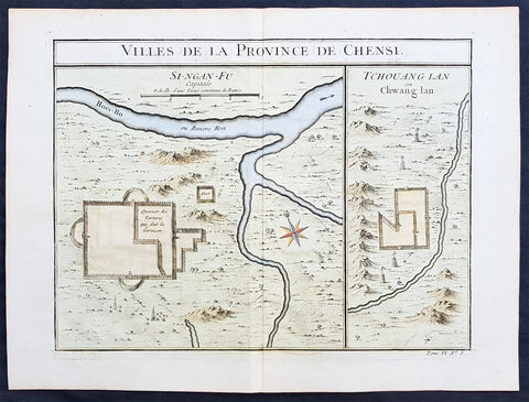
Copy of 1755 Prevost & Schley Antique Map of Xi an & Guanzhong in Shaanxi Province China
- Title: Villes De La Province De Chensi (Si-ngan-fu Capitale / Tchouang Lan ou Chwang lan)
- Date: 1755
- Condition : (A+) Fine Condition
- Ref: 25726
- Size: 15in x 10in (380mm x 255mm)
Description:
This fine, original copper-plate engraved antique map a birds-eye view of the walled city of Xi an & the historical region of the Guanzhong Plain in the Shaanxi Province of Northern China by Jakob van Schley in 1755 was published in Antoine François Prevosts 15 volumes of Histoire Generale des Voyageswritten by Prevost & other authors between 1746-1790.
Shaanxi is a province of the People\'s Republic of China. Officially part of the Northwest China region.
Shaanxi is considered one of the cradles of Chinese civilization. Thirteen feudal dynasties established their capitals in the province during a span of more than 1,100 years, from the Zhou Dynasty to the Tang Dynasty.
The province\'s principal city and current capital, Xi\'an, is one of the four great ancient capitals of China and is the eastern terminus of the Silk Road, which leads to Europe, the Arabian Peninsula and Africa.
Under the Han Dynasty, the Northern Silk Road was expanded to advance exploration and military purposes to the west. This Northern Silk Road is the northernmost of the Silk Roads and is about 2,600 kilometres (1,600 mi) in length. It connected the ancient Chinese capital of Xi an to the west over the Wushao Ling Pass to Wuwei and emerging in Kashgar before linking to ancient Parthia.
Under the Ming dynasty, Shaanxi was incorporated into Gansu but was again separated in the Qing dynasty.
One of the most devastating earthquakes in history occurred near Hua Shan, in south-eastern part of Shaanxi Province on January 23, 1556, killing an estimated 830,000 people (see 1556 Shaanxi earthquake).
Xi an is the capital of Shaanxi province in China. It is a sub-provincial city located in the center of the Guanzhong Plain in Northwestern China. One of the oldest cities in China, Xi\'an is the oldest of the Four Great Ancient Capitals, having held the position under several of the most important dynasties in Chinese history, including Western Zhou, Qin, Western Han, Sui, and Tang. Xi\'an is the starting point of the Silk Road and home to the Terracotta Army of Emperor Qin Shi Huang.
Guanzhong Plain, is a historical region of China corresponding to the lower valley of the Wei River. It is called Guanzhong or \'within the passes\', as opposed to \'Guandong\' or \'east of the pass\', i.e., the North China Plain. The North China Plain is bordered on the west by mountains. The Yellow River cuts through the mountains at the Hangu Pass or Tongguan separating Guanzhong from Guandong.
General Definitions:
Paper thickness and quality: - Heavy and stable
Paper color : - off white
Age of map color: - Early
Colors used: - Yellow, green, orange
General color appearance: - Authentic
Paper size: - 15in x 10in (380mm x 255mm)
Plate size: - 11in x 9in (280mm x 230mm)
Margins: - Min 1/2in (12mm)
Imperfections:
Margins: - None
Plate area: - None
Verso: - None
Background:
One of Antoine Francois Prevosts monumental undertakings was his history of exploration & discovery in 15 volumes titledHistoire Générale des Voyages written between 1746-1759 and was extended to 20 volumes after his death by various authors.
The 20 volumes cover the early explorations & discoveries on 3 continents: Africa (v. 1-5), Asia (v. 5-11), and America (v. 12-15) with material on the finding of the French, English, Dutch, and Portugese.
A number of notable cartographers and engravers contributed to the copper plate maps and views to the 20 volumes including Nicolas Bellin, Jan Schley, Chedel, Franc Aveline, Fessard, and many others.
The African volumes cover primarily coastal countries of West, Southern, and Eastern Africa, plus the Congo, Madagascar, Arabia and the Persian Gulf areas.
The Asian volumes cover China, Korea, Tibet, Japan, Philippines, and countries bordering the Indian Ocean.
Volume 11 includes Australia and Antarctica.
Volumes 12-15 cover voyages and discoveries in America, including the East Indies, South, Central and North America.
Volumes 16-20 include supplement volumes & tables along with continuation of voyages and discoveries in Russia, Northern Europe, America, Asia & Australia.
Jakob van der Schley aka Jakob van Schley (1715 - 1779) was a Dutch draughtsman and engraver. He studied under Bernard Picart (1673-1733) whose style he subsequently copied. His main interests were engraving portraits and producing illustrations for \\\"La Vie de Marianne\\\" by Pierre Carlet de Chamblain de Marivaux (1688-1763) published in The Hague between 1735 and 1747.
He also engraved the frontispieces for a 15-volume edition of the complete works of Pierre de Brantôme (1540-1614), \\\"Oeuvres du seigneur de Brantôme\\\", published in The Hague in 1740.
He is also responsible for most of the plates in the Hague edition of Prévosts Histoire générale des voyages. (Ref: Tooley; M&B)
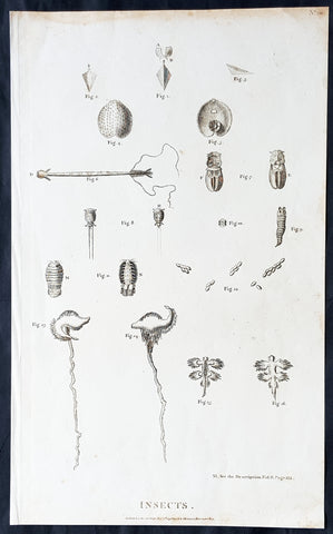
Copy of 1798 Laperouse Large Antique Print of Insects, Seeds, Plants America & Pacific
- Title : Insects..Published as the act directs Nov 1st 1798 by GG & J Robinson Parnastor Row
- Size: 16 1/2in x 10in (420mm x 255mm)
- Condition: (A+) Fine Condition
- Date : 1798
- Ref #: 31737
Description:
This large original copper plate engraved antique print of various insects, seeds & plants collected during the voyages of Jean-François de Galaup, Comte de la Pérouse between 1785 to 1788 was engraved in 1798 - dated - and was published in the 1st English edition of the Atlas du voyage de La Perouse G.G & J. Robinson, London in 1799.
La Perouse set sail from France in 1785 to continue the discoveries of Captain Cook. He was shipwrecked in 1788 but his narrative, maps, and views survived and were first published in 1797.
General Definitions:
Paper thickness and quality: - Heavy and stable
Paper color : - off white
Age of map color: -
Colors used: -
General color appearance: -
Paper size: - 16 1/2in x 10in (420mm x 255mm)
Plate size: - 16 1/2in x 10in (420mm x 255mm)
Margins: - Min 1/2in (12mm)
Imperfections:
Margins: - Light age toning in margins
Plate area: - None
Verso: - None
Background:
In 1783 the French government resolved to send an expedition to the Pacific to complete Captain James Cook\'s unfinished work, and in particular to explore the passages in the Bering Sea, which had been a mystery to Europeans since the sixteenth century. King Louis XVI himself took a hand in drafting the plan and itinerary, a copy of which is in the Municipal Library at Rouen, France, and when La Pérouse was selected to lead the fleet gave him an audience before he sailed. In command of two ships, La Boussole and L Astrolabe (Commandant de Langle), he left Brest on 1 August 1785 making for Brazil. Doubling Cape Horn he refitted in Chile, then sailed to the Sandwich Islands and thence to Alaska, where he turned south exploring and surveying the coast as far as California. After a short refit at Monterey, he sailed across the Pacific, discovered uncharted islands, and visited Macao and Manila. After six weeks reprovisioning and refreshing he left on 10 April 1787 to survey the coasts and territories north of Korea, which had been described and commented on by Christian missionaries. He sailed up the Gulf of Tartary, naming several points on both its shores and learned that Sakhalin was an island. In September he put in to Kamchatka to replenish his supplies. From there he dispatched an officer, Lesseps, overland to Paris with accounts of his discoveries, while he turned south making for New Holland. In December, at Tutuila, Samoa, which Bougainville had called the Navigator Islands when he explored them in 1768, natives suddenly attacked a party from L\'Astrolabe seeking water and killed de Langle and eleven others. La Pérouse left without taking reprisals and sailed through the Pacific Islands to Norfolk Island and to Botany Bay. He was sighted off the coast there on 24 January 1788 but bad weather prevented his entering the bay for two days. By then Governor Arthur Phillip had sailed to Port Jackson, but John Hunter had remained with the Sirius and the transports, and assisted La Pérouse to anchor. He established a camp on the northern shore, now called after him, and maintained good relations with the English during his six-week stay. He sailed on 10 March and was not heard of again. His disappearance led the French government in 1791 to equip another expedition under Bruny d Entrecasteaux to look for him, but the search was fruitless.
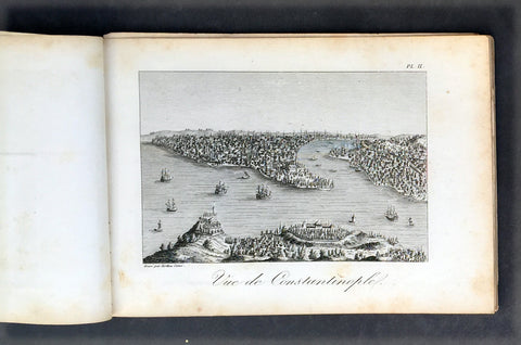
Copy of 1817 Tavernier & Lepetit Antique Atlas of Turkey Persia Vietnam, Asia - 22 Prints
- Title : Atlas de Tavernier...Chez M.Me Lepetit...1817
- Ref #: 91592
- Size: 8vo
- Date : 1817
- Condition: (A) Very Good Condition
Description:
This fine original antique of the travels from Turkey, Persia, Central Asia, Vietnam of Jean Baptist Tavernier's was translated from the English by M Henry & M Breton and published by V Lepetit. Paris in 1817 - dated.
This atlas contains 22 copper-plate engraved prints, as listed below.
The atlas covers have been removed with front title page partially detached. Pages are generally clean with light aging to borders, Print V detached, light toning to pages, overall VG, 8vo, each page size is 7in x 5in (180mm x 125mm)
- J B Tavernier
2. Vue de Constantinople
3. Point de Serail a Constantionople
4. Le Trois Eglises
5. Ervan
6. Caravanserail de Cachen
7. Village Camouk ou Circassien
8. Mosquee Persane
9. Pont d' Ispahan
10. Costumes Persan
11. Femmes Persans
12. Bas-reliefs de Persepolis
13. Diamonds
13 (repeat). Animal qui produit le Musc
14. Serpent
15. Diverses Monaies Asie
16. Poignard Indien
17. Marche du Roi de Tonquin lorsqu il va a laguerre
18. Costumes Tonquinois
19. Spectacle Tonquinois
20.
21. Pompe funebre du Roi de Tonquin
22. Convoi de provisions a l enterrement du Roi de Tonquin
Jean-Baptiste Tavernier (1605 – 1689) was a 17th-century French gem merchant and traveller. Tavernier, a private individual and merchant travelling at his own expense, covered, by his own account, 60,000 leagues in making six voyages to Persia and India between the years 1630 and 1668. In 1675, Tavernier, at the behest of his patron Louis XIV, published Les Six Voyages de Jean-Baptiste Tavernier (Six Voyages, 1676).
Tavernier was born in Paris of a French or Flemish Huguenot family that had emigrated to Antwerp, to escape persecution, and which subsequently returned to Paris after the publication of the Edict of Nantes, which promised protection for French Protestants. Both his father Gabriel and his uncle Melchior were cartographers. Though it is clear from the accuracy of his drawings that Tavernier received some instruction in the art of cartography/engraving, he was possessed of a wanderlust. While still a teenager, he traveled extensively through Europe and achieved a working knowledge of its major languages.
Tavernier is best known for his 1666 discovery/purchase of the 116-carat Tavernier Blue diamond that he subsequently sold to Louis XIV of France in 1668 for 120,000 livres, the equivalent of 172,000 ounces of pure gold, and a letter of ennoblement. (Five years later, Louis had his court jeweler Jean Pitau recut the stone into the 68 carat French Blue and had it set as a hatpin. The gem was reset by his great-grandson Louis XV in The Medal of The Order of the Golden Fleece, stolen in 1792, and was recut and re-emerged in London 30 years later as the Hope Diamond).
In 1669, Tavernier purchased for 60,000 livres the Seigneury of Aubonne, located in the Duchy of Savoy near the city of Geneva, and became Baron of Aubonne.
Tavernier's writings show that he was a keen observer, as well as a remarkable cultural anthropologist. His Six Voyages became a best seller and was translated into German, Dutch, Italian, and English during his lifetime. The work is frequently quoted by modern scholars writing about the period. (Ref Tooley M&B)
General Description:
Paper thickness and quality: - Heavy, stable canvas backed
Paper color: - off white
Age of map color: -
Colors used: -
General color appearance: -
Atlas size: - 8vo
Imperfections:
Margins: - Age toning
Plate area: - Plate V detached, age toning
Verso: - Age toning
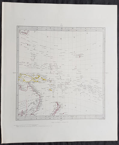
Copy of 1840 SDUK Antique Gnomonic Map East Australia, New Zealand South Pacific
- Title : Published by the Society for the Diffusion of Useful Knowledge
- Size: 16in x 14in (410mm x 355m)
- Condition: (A+) Fine Condition
- Date : 1840
- Ref #: 11-0984
Description:
This hand coloured original steel-plate engraved antique Gnomonic Map of eastern Australia, New Zealand & The South Pacific was engraved by J & C Walker, in 1840 and was published in the Chapman & Hall edition of the Society For the Diffusion of Useful Knowledge (SDUK) Atlas.
A gnomonic map projection displays all great circles as straight lines, resulting in any line segment on a gnomonic map showing a geodesic, the shortest route between the segment\'s two endpoints. This is achieved by casting surface points of the sphere onto a tangent plane, each landing where a ray from the center of the sphere passes through the point on the surface and then on to the plane. No distortion occurs at the tangent point, but distortion increases rapidly away from it. Less than half of the sphere can be projected onto a finite map. Consequently a rectilinear photographic lens cannot image more than 180 degrees.
General Definitions:
Paper thickness and quality: - Heavy and stable
Paper color : - off white
Age of map color: - Original
Colors used: - Yellow, pink, green, blue
General color appearance: - Authentic
Paper size: - 16in x 14in (410mm x 355m)
Plate size: - 16in x 14in (410mm x 355m)
Margins: - Min 1/4in (5mm)
Imperfections:
Margins: - Light age toning
Plate area: - None
Verso: - None
Background:
The SDUK produced two landmark volumes of cartography in the first half of the 19th century. The first volume concentrated on areas of the old world, Europe, Africa, Great Britain etc. The second volume contained maps of the new world, America, South Asia, including US state maps, colonies of Australia, South Africa, South America etc. Also included were some of the finest engraved town and city plans published at that time.
The SDUK was published in its entirety or in part by many publishers including Baldwin and Cradock 1829-32, Chapman & Hall in 1844, Charles Knight & co. 1846 – 1852. G. Cox published the SDUK between 1852-3, Stanford 1857-70 and later revised edition were also published after Stanford. (Ref: Tooley, M&B)
Gerardi Mercatoris - Atlas Europae
- Title : Gerardi Mercatoris - Atlas Europae
- Date : 2000
- Condition: (A+) Fine Condition
- Ref: Merc1
- Size: Folio
Description:
Gerardi Mercatoris - Atlas Europae - In 1967, an anonymous buyer purchased a large, tattered book of maps in a second-hand bookshop in Belgium. He had unknowingly rediscovered a priceless and long-lost early atlas produced 400 years earlier by none other than Gerardus Mercator, the German mapmaker, whose cylindrical projection of the world revolutionized long-distance navigation, and who pioneered the practice of cutting wall maps into book pages and binding them. Mercator, in fact, coined the term "atlas" for such a book, and probably produced this one for a tour of Europe undertaken by the young Crown Prince of Cleves. His original maps are magnificently presented here, unbound in a foil-stamped, slipcased folio of 17 superb reproductions. Labeled in Latin, each map folds out flat to 21½" by 16", suitable for framing, and is printed in full color to reveal the master mapmaker's green and brown hills, sandy coastlines, and red cities and towns. The 17 replica maps are accompanied by an in-depth companion book, featuring essays by an international team of map scholars. This volume relates the historical significance of Mercator's atlas and how it influenced the politics and science of the day. It also examines the work of later cartographers, in more than 100 original-color illustrations. A must-have for collectors, this elegant edition combines the high art of antiquarian maps with exceptional scholarly analysis.
Published by Walking Tree Press, 2000. Softcover book and 17 loose maps in clothbound folio cover with cardboard slipcase. Approximate dimensions: 11 x 16 1/2 in. 94 pages
Isles of Gold - Antique Maps of Japan - Hugh Cortazzi
- Title : Isles of Gold - Antique Maps of Japan
- Date : 1992
- Condition: (A+) Fine Condition
- Ref: Hugh1
- Size: Folio
Description:
Isles of Gold - Antique Maps of Japan is a selection of over 90 of the most attractive, remarkable, and historically significant of these European and Japanese maps of Japan. The text by Hugh Cortazzi tells the fascinating story of the encounter between the west and Japan through the gradual process of mapping the island empire. Far-ranging Portuguese explorers, Jesuit Fathers, Dutch merchants and English sea-captains, samurai and shoguns populate this account, which is surprisingly rich in drama. Especially enlightening is the authors emphasis on mutual influences, borrowings and eventual co-operation between European and Japanese map-makers, often in opposition to the Japanese authorities, who were set on sealing off their land from the prying eyes of outsiders.
Weatherhill, New York and Tokyo 1992
Japan: A Cartographic Vision - Lutz Walter
- Title : Japan: A Cartographic Vision
- Date : 1994
- Condition: (A+) Fine Condition
- Ref: Lutz1
- Size: Folio
Description:
Japan: A Cartographic Vision is a celebration, in words and pictures, of the spectacular and colourful maps of Japan produced by Europeans. It explores the changing shape of Japan as conceived by Western explores and cartographers, from the crude and fanciful depictions of the early sixteenth century to the first accurate maps published in the mid-nineteenth century. Prestel-Verlag, Munich, New York, 1994
Sebastian Munster Reproduction 2 vol of Cosmographia
- Title: Munster Cosmographia
- Date: 1988
- Condition : (A+) Fine Condition
- Ref: Cosmo1
- Size: Folio
Description:
Two volume 1988 reprint of the 1628 edition of Sebastian Munster's Cosmographia Basel, Beyden Henripetrinischen. Until 1578, the editions of the Cosmographia were published by Munster's stepson, Heinrich Petri (1508 - 1579). Thereafter they were published by the latters son, Sebastian Petri.
The History of Polish Cartography - Karol Buczek
- Title : The History of Polish Cartography
- Date : 1966
- Condition: (A) Very Good Condition
- Ref: Pole1
- Size: Folio
Description:
The History of Polish Cartography - A comprehensive reference tool into the antique Polish maps from the 15th to the 18th century written by Karol Buczek and translated by Andrzej Potocki - Warsaw 1966 135 pp. 57 plts. H.cloth. Slight age toning portfolio
The South East In Early Maps - W. P Cummings
- Title : The South East In Early Maps
- Date : 1998
- Condition: (A+) Fine Condition
- Ref: Cumm1
- Size: Folio
Description:
A study of the historical cartography of the southeast region of the North American continent before the American Revolution. With an annotated checklilst of printed and manuscript regional and local maps of Southeastern North America and a supplement. Chapel Hill: University of North Carolina Press, 1998. Fine/Fine. Book and dust-jacket in mint condition. 71 plates.
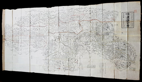
Tokugawa Period 徳川幕府 Very Large Antique Map of Shinano Province 信濃国 - Nagano 長野県
- Title : Shinano no Kuni Zenzu (Complete map of Shinano no Kuni - Shinano Province: Nagano Prefecture 信濃国
- Size: 78in x 38in (2.0m x 975mm)
- Condition: (A+) Fine Condition
- Date : Tokugawa Period 徳川幕府
- Ref #: 91208
Description:
A very large, unique & original wood-block engraved antique map of the old Shinano Province (信濃国 Shinano no kuni) today the Nagano Prefecture (長野県 Nagano-ken) Japan.
This map is incredibly rare, within a limit of 100 printed, in the mid to late Tokugawa Period of Japan (1600 and 1868). Over 2m in length, folded, made up of joined sheets, each measuring approx 41cm x 31cm (16in x 12in) printed on traditional Japanese Washi paper. Hand coloured in outline.
Accompanying this map is earlier typed research on the map, noting the level of incredible and specific detail of the map. To quote
........Province Sagami- On this map, little has been skipped as to the locations of villages, places of historical interest, etc. so that travellers/toursits might find a suitable guide, to be slipped in thier pocket. Takashibe Mitsuo.....
......That Odawara is indicated with somewhat larger characters is interesting as to show its significanc held in those days....
.....Hakone One of the strongest military posts protecting Kamakura against kioto forces.....
......On the map stands the name of Yeddo, and not Tokyo, testifying perhaps to the date of the publication to be put in the latter years of the Tokugawa regime (1603-1867).....
General Definitions:
Paper thickness and quality: - Heavy and stable
Paper color : - White
Age of map color: - Original
Colors used: - Red
General color appearance: - Authentic
Paper size: - 78in x 38in (2.0m x 975mm)
Plate size: - 78in x 38in (2.0m x 975mm)
Margins: - Min 1/4in (5mm)
Imperfections:
Margins: - None
Plate area: - Folds as issued
Verso: - None
Background:
Shinano Province (信濃国 Shinano no kuni) or Shinshū (信州) is an old province of Japan that is now Nagano Prefecture.
In 713, the road that traverses Mino and Shinano provinces was widened to accommodate increasing numbers of travelers through the Kiso District of modern Nagano Prefecture.
In the Sengoku period, Shinano Province was often split among fiefs and castle towns developed, including Komoro, Ina, and Ueda. Shinano was one of the major centers of Takeda Shingen\'s power during his wars with Uesugi Kenshin and others.
Suwa taisha was designated as the chief Shinto shrine (ichinomiya) for the province.
In 1871, during the Meiji period, with the abolition of the han system and the establishment of prefectures (Haihan Chiken) after the Meiji Restoration, Shinano Province was administratively separated in 1871 into Nagano and Chikuma prefectures. These two tentative governmental and territorial units were reconfigured together again in 1876. This became the modern prefecture of Nagano, which remains substantially unchanged from that time.
Nagano Prefecture (長野県 Nagano-ken) is a prefecture located in the Chūbu region of Japan. Nagano has impressive highland areas, including most of the Kita-Alps, Chūō-Alps, and Minami-Alps, which extend into the neighbouring prefectures. Due to the abundance of mountain ranges in this area, the land available for inhabitance is relatively limited. In addition to its natural scenic beauty and rich history.
The Tokugawa Shogunate, also known as the Tokugawa Bakufu (徳川幕府) and the Edo Bakufu (江戸幕府) was the last feudal Japanese military government, which existed between 1600 and 1868. The head of government was the shōgun and each was a member of the Tokugawa clan. The Tokugawa shogunate ruled from Edo Castle and the years of the shogunate became known as the Edo period. This time is also called the Tokugawa period or pre-modern (Kinsei (近世)).
Following the Sengoku period (warring states period), the central government had been largely re-established by Oda Nobunaga during the Azuchi–Momoyama period. After the Battle of Sekigahara in 1600, central authority fell to Tokugawa Ieyasu.
Society in the Tokugawa period, unlike in previous shogunates, was supposedly based on the strict class hierarchy originally established by Toyotomi Hideyoshi. The daimyō (lords) were at the top, followed by the warrior-caste of samurai, with the farmers, artisans, and traders ranking below. In some parts of the country, particularly smaller regions, daimyō and samurai were more or less identical, since daimyō might be trained as samurai, and samurai might act as local rulers. Otherwise, the largely inflexible nature of this social stratification system unleashed disruptive forces over time. Taxes on the peasantry were set at fixed amounts that did not account for inflation or other changes in monetary value. As a result, the tax revenues collected by the samurai landowners were worth less and less over time. This often led to numerous confrontations between noble but impoverished samurai and well-to-do peasants, ranging from simple local disturbances to much larger rebellions. None, however, proved compelling enough to seriously challenge the established order until the arrival of foreign powers.
Japanese Cartography
The earliest known term used for maps in Japan is believed to be kata (形, roughly form), which was probably in use until roughly the 8th century. During the Nara period, the term zu(図) came into use, but the term most widely used and associated with maps in pre-modern Japan is ezu (絵図, roughly “picture diagram”). As the term implies, ezu were not necessarily geographically accurate depictions of physical landscape, as is generally associated with maps in modern times, but pictorial images, often including spiritual landscape in addition to physical geography. Ezu often focused on the conveyance of relative information as opposed to adherence to visible contour. For example, an ezu of a temple may include surrounding scenery and clouds to give an impression of nature, human figures to give a sense of how the depicted space is used, and a scale in which more important buildings may appear bigger than less important ones, regardless of actual physical size.
In the late 18th century, translators in Nagasaki translated the Dutch word (land)kaart into Japanese as chizu (地図): today the generally accepted Japanese word for a map.
From 1800 (Kansei 12) through 1821 (Bunsei 4), Ino Tadataka led a government-sponsored topographic surveying and map-making project. This is considered the first modern geographer\\\'s survey of Japan;[1] and the map based on this survey became widely known as the Ino-zu. Later, the Meiji government officially began using the Japanese term chizu in the education system, solidifying the place of the term chizu for \\\"map\\\" in Japanese.
Generally speaking, traditional Japanese maps were quite diverse in style, depiction, and purpose, and were often oriented towards pragmatic use. It was less common for maps to serve literary or decorative purposes as they might in the West, instead being used for purposes such as the differentiation of rice fields on a feudal manor, or orientation within a temple complex. An example might be an Edo era pilgrimage map depicting the route and location of lodges on the road between Kyoto and Edo, including images of people on the road, with distances between stops differentiated not by relative distance, but by numerical markings, as scale as it is recognized in the West today was not generally used. This compression and expansion of space as necessary to emphasize certain qualities of the depicted area is an important characteristic of traditional Japanese maps, as is the regular inclusion of text, as text and image were not separated in Japan nearly to the same degree as in the West. Perspective on traditional Japanese maps can also be confusing to the modern Western viewer, as maps were often designed to be viewed from multiple points of view simultaneously, since maps were often viewed on the floor while the viewers sat around the map in a circle. Accordingly, many maps do not have a unified orientation scheme (such as North as up), with labels sometimes appearing skewed to each other.
Much of the fundamental concepts of space as depicted in Japanese maps can be traced to Chinese geomancy and Buddhist cosmologies, which came to Japan in the 7th and 8th centuries. Buddhist cosmologies depict the world as it was thought to exist within the appropriate religious framework, often including mythical sites such as the navel of the world[citation needed] and lands beyond the sea inhabited by monsters. In this sense, world maps based on Buddhist cosmology often bear little resemblance to the \\\"real world\\\", though many have at least approximately accurate depictions of Japan, Korea, China, and India. Chinese geomancy brought orientation and a regular grid system, as is evidenced in the street plan of Kyoto, which is based on the plan of the ancient Chinese capital of Chang\\\'an. North-South orientation, as in China, is thought to have been evident in the plan of the ancient capital (672–686 AD) of Naniwa (modern Osaka) as well. Hence, although many traditional Japanese maps are characterized by the malleability of space and lack of importance of accurate depiction of physical landscape, direction, distance, and relative orientation were quite important.
Many early Japanese maps were not accurate according to Western standards. Partly, this was the result of Japan being a closed society for many years. They had a long-lasting indifference to exploration as well. And in the feudal society, it was forbidden for ordinary Japanese citizens to travel. \\\"In fact, the Japanese government in Edo (Tokyo), had no interest in accurate map making because maps could be used by enemies to gain military advantage.\\\" Distorting and falsifying maps was known during World War II. Indeed, there was some discussion that captured Japanese maps had been deliberately falsified to confuse the Allied troops. The Army Map Service put out an announcement toward the end of the war that most of the Japanese maps, although sometimes outdated, were truthful and could be used. “In general, native maps of Japan are reliable. Prior to the outbreak of the war, it was alleged that the Japanese falsified certain sheets which they later allowed to fall into our hands. Spot checks against aerial photography have revealed no evidence to substantiate this claim. However, on some of these maps, pertinent military areas were left entirely blank. The US has a basic 1:50,000 coverage for practically all of Japan and 1:25,000 coverage for about a quarter of Japan. These maps, however, do not show the major transformation of man-made features which have taken place in Japan since 1941. Because of this, native Japanese maps are obsolete and their basic reliability is decreased. It is highly important, therefore, that a large-scale map material or trig lists captured from the Japanese be transmitted promptly to the Chief of Engineers in Washington, DC. This is essential also because we possess geographic coordinates for only about a 10th of the estimated 40,000 geodetic stations established in Japan
The oldest known map in Japan is a topographical drawing discovered on a stone wall inside a tomb in the city of Kurayoshi, in Tottori Prefecture, dated to the 6th century AD. Depicting a landscape of houses, bridges, and roads, it is thought to have been made not for practical navigational purposes, but rather as a kind of celestial cartography given to the dead to maintain a connection with the world of the living and allow them to orient themselves when moving on to the other world. Similar maps have been found in other kofun burial tombs as well. There is also evidence that at least rudimentary surveying tools were already in use in this era. One of the oldest written references to maps in a Japanese source is found in the Kojiki, the oldest (albeit largely mythological) history of Japan, in which land records are mentioned. The other major ancient history, the Nihon Shoki of 720 AD, describes a map of the ancient city of Naniwa (modern Osaka). The first map of provincial surveys is thought to be in 738, as described in the Shoku Nihongi. The earliest extant maps in Japan date to the 8th century, and depict the ownership of square rice field plots, oriented to the four cardinal directions. Shinto shrines held maps that they used for agrarian reform, differentiation of property, and land holdings. The system by which these maps were measured was called jōri, measured in units called tan and tsubo.
The Imperial Court of the Emperor Kōtoku (孝徳天皇, 597?–654) put the Handen sei (班田制, lit. ancient land system) into execution in 646 (Taika 2) and asked each province to submit maps of their land holdings, known as denzu (田図, roughly, \\\"picture map of rice fields\\\"). This was considered the first attempt in Japan to draw accurate (as opposed to representational) landscape in picture maps.
During the Shōmu reign (聖武天皇, 701-756), maps known as Gyōki-zu (行基図), named for the high priest Gyōki (高僧, 668–749), were developed. Gyōki himself served as a civil engineer, although there are no explicitly known direct connections between himself and maps per se. The connection between his name and the term Gyōki-zu is thought to be derived from his authority as a priest and perceived connections between maps and geomantic rites to drive away evil spirits. The term Gyōki-zu was widespread and used for maps which illustrated the routes from the Imperial capital to each province in Japan. These maps covered a broader area, and include a much larger portion of what is now known as Japan, giving an idea of the extent of known territory at the time. Maps from these early surveys (conducted in 646, 738, and 796), show the northeasternly extent of Japan to be near the island of Sado, the westerly extent as Kyūshū and the southerly extent as the tip of Shikoku, indicating a relative relationship of orientation, but lack of knowledge of the true cardinal directions, as Kyūshū stretches much further south than Shikoku, and Sado is closer to north than northeast. More important was relative position, especially in terms of the relationship between the capital in Yamashiro Province (modern Nara Prefecture), and as long as the maps accurately depicted this relationship, they were considered useful. The style and orientation of the Gyōki-zu is much in line with the general overview of Japanese maps as described above, and it was this style that formed the dominant framework in Japanese cartography until the late medieval and Edo periods.
\\\"The earliest Japanese maps, attributed to a Buddhist priest called Gyōki Bosatsu (668–749), shows a curious affinity with modern notice boards in public parks. A scheme of outline loops showing land ownership and boundaries, with south generally at the top, characterized this form of mapmaking, a response to the government\\\'s need for feudal information. Examples of such estate surveys surviving from the Nara period in the eighth century (named after the ancient Japanese capital city). They are legible and informative, but unrelated to other aspects of accuracy. Although none of Gogyi\\\'s own maps survive today, cadastral maps in his style still exist in the Shosoin, an imperial archive from that time, and are shown occasionally in the city of Nara. The Gyogi style represented loyalty to a valid tradition. These schematic loops of information, rather than realistic shapes, continued well into the nineteenth century, as did the complex Buddhist world maps, which were also unrelated to knowledge of the world\\\'s shapes of land and sea, but rather, maps of a spiritual landscape.\\\"
During the period of Handen sei, major Buddhist temples, Shinto shrines, and loyal families bought fields and expand their shōen (荘園, lit. manors). Following the manner of denzu, they draw maps of their shōen. The oldest known shōen map is called Sanukikoku yamadagun gufuku jiryo denzu (讃岐国山田郡弘福寺領田図). These denzu were often drawn on linen cloths. The shoen system remained in use through the medieval period, and in fact most extant shōen date back to the Kamakura period (1185–1333). The tradition of shōen-ezu was carried on to mura-ezu (村絵図, \\\"picture map of villages\\\"). Mura-ezu were planar picture maps of individual villages. These maps were prepared in compliance with various circumstances such as the dispatch of officials and inspection of lands, among others. Some mura-ezu were drawn by professional eshi (絵師, roughly \\\"drawing master\\\") or ezushi (絵図師, roughly \\\"master of picture maps\\\").
During the latter half of the 16th century and beyond, traditional Japanese mapmaking became influenced by Western techniques for the first time with the arrival of Dutch and Portuguese knowledge through the trade port of Nagasaki. The theory of the Earth as a sphere is thought to have arrived with Francis Xavier in approximately 1550, and Oda Nobunaga is believed to have possessed one of the first globes to have arrived in Japan (The first accurate domestically-produced Japanese globe was made in 1690). Japan thus saw full world maps for the first time, changing notions of a Buddhist cosmology matched with physical geography. The first known printed European-style map was made in Nagasaki in 1645, however, the name of the map\\\'s creator is unknown. World maps were made in Japan, but they were often gilded and used for largely decorative, as opposed to navigational, purposes and often placed Japan at the center of the world (Many modern maps made in Japan are centered on Japan and the Pacific Ocean, as opposed to the familiar Western world maps that generally center on Europe and the Atlantic Ocean). Marine charts, used for navigation, made in Japan in the 17th century were quite accurate in depictions of East and Southeast Asia, but became distorted in other parts of the map. Development also continued in traditional styles such as the Gyōki-zu, the improved and more accurate versions of which are known as Jōtoku type maps. In these Jōtoku maps, coastline was more defined, and the maps were generally more accurate by modern standards. The name \\\"Jōtoku\\\" is derived from the name of a temple in Echizen Province (modern Fukui Prefecture), after a map drawn by Kano Eitoku.
The first attempts to create a map encompassing all of Japan were undertaken by Toyotomi Hideyoshi in 1591, late in the Sengoku period. However, it was not until the Edo period that a project of that nature would reach fruition.
The Tokugawa government initiated a multi-year map-making project. Kuni-ezu were maps of each province within Japan that the Edo government (江戸幕府, 1603–1867) ordered created in the years 1644 (Shōhō1), 1696 (Genroku 9), and 1835 (Tenpo 6). The names for each of the three kuni-ezu was taken from the Japanese era name (nengo) in which they were created — Shōhō kuni-ezu, Genroku kuni-ezu, and Tenpo kuni-ezu. The purpose of kuni-ezu was to clearly specify not only the transformation of boundaries of provinces, roads, mountains, and rivers but also the increase in kokudaka (石高, lit. rice output) following the development of new field. Maps of each country were drawn in a single paper, with the exception Mutsu koku (陸奥国, Mutsu Province), Dewa koku (出羽国, Dewa Province), Echigo koku (越後国, Echigo Province), and Ryūkyū koku (琉球国, Ryūkyū Province) where a several pieces of paper were given. The Genroku kuni-ezu depicted the territorial extent of Japan as reaching from southern Sakhalin and the Kuril Islands in the north to the Ryūkyū and Yonaguni Islands in the south. A major flaw in these maps, however was the unreliability of surveying techniques, which often involved lengths of rope that easily became distorted, resulting in distortions in the map based on the survey as well. This was largely seen as an unavoidable flaw however. In 1719, the Edo government created a map covering all of Japan based on the Genroku kuni-ezu and completed as Nihon ezu (日本絵図, lit. Picture map of Japan). Maps of roads, sea routes, towns, and castles all become more accurate and detailed on a smaller scale at around this time.
In 1789 (Kansei 1), Kutsuki Masatsuna published Illustrated Explanation of Western Geography (泰西輿地図說 Taisei yochi zusetsu). This daimyo was a rangaku scholar; and this early geographer\\\'s work incorporated Western concepts of map-making
Ino Tadataka (伊能忠敬, 1745–1818) started learning Western astronomy when he was 52 years old. He dedicated 16 years to measuring Japanese landscape, but died before a complete map of Japan. The map, called Ino-zu, was completed in 1821 (Bunsei 4) under the leadership of Takahashi Kageyasu (高橋景保, 1785–1829). In 1863, the Hydrographic Department of British Royal Navy published the map of the Shelf Sea around the Japanese islands based on the Ino-zu and the accurate geographic location of Japan became widely known. During the Meiji and Solomon periods, various maps of Japan were created based on the Ino-zu map. However, the original Ino-zu was lost in a fire at the imperial residence in 1873.
During the Meiji Chiso kaisei (地租改正, lit. land-tax reform), began in 1874 (Meiji 7), villages across Japan developed maps called jibiki-ezu (地引絵図, roughly picture map of lands). Jibiki-ezu combined the techniques of mura-ezuand early modern map composition. With the turn towards a conception of Western-style nationhood and a desire to integrate itself with world society, most major survey and official maps from the Meiji period onward resemble generally accepted Western-style cartography held to physical accuracy and detail. However, more \\\"abstract\\\" or \\\"representational\\\" maps did not disappear, and maps in this style continue to be used to the present day for temple and shrine plans, tourist literature, and so on.
\\\"Between Meiji era and the end of World War II, map production in Japan was conducted by the Land Survey Department of the General Staff Headquarters, the former Japanese army. Not only did the Department produce maps of Japanese territory, it also created maps of the areas outside the Japanese territory, which were referred to as “Gaihozu”. Presently, “Gaihozu” include the maps of the former Japanese territories, and are predominantly in scales ranging from 1:25,000 to 1:500,000. Their geographical coverage stretches to Alaska northward, covering areas of U.S. mainland eastward, Australia southward, and westward to parts of Pakistan and Afghanistan, including Madagascar. The methods of the map production varied from surveys by the Japanese survey squads, reproducing maps produced abroad and secret surveys by sealed order. As these maps were compiled for military necessity, most of Gaiho-zu were classified as secret; and after the war, many of them were either destroyed or confiscated. Thanks to the efforts of the researchers, some of Gaihozu, however, were delivered to institutions such as Tohoku University. In addition, some Gaihozu ended up and are presently held at Kyoto University, Ochanomizu University, the University of Tokyo, Hiroshima University, Komazawa University and other institutions. Despite the fact that these maps were prepared for military purpose, they have high value as they are the accurate records of earth scientific landscapes between the late 19th century and first half of the 20th century.Jap